


Related Blogs

From the time SharePoint Framework was launched, it opened new ways for SharePoint Developers to build and deploy modern web parts across Office 365 tenants. SharePoint Framework availability enabled the users to build mobile-friendly, intuitive web parts using latest web developer tools.
SharePoint Extensions Overview
To build on this momentum and with an idea to extend the SharePoint user experience, Microsoft added a new capability in form of SharePoint Framework extensions. Using SharePoint Framework extensions, you can extend SharePoint user interface areas within modern pages and document libraries, which include notification areas, toolbars and menus, and presentation of lists. Moreover, it leverages support of the new GraphHttpClient object.
Below are the extension types that SharePoint Framework contains:
- Application Customizers
- Embeds visible or hidden scripts on a page, and uses predefined HTML element placeholders and extends them with customized renderings.
- Scope: Site collection, site or list
- Field Customizers
- Provides customized views to data within list fields
- It can be used to override field views in a list.
- It can be used with site columns or directly on the list columns.
- Command Sets
- Allows to extend SharePoint command surfaces, adding new actions with client-side scripts that can be used to implement behaviors.
- Provides action buttons to a list.
- Toolbar and context menu supportive.
In addition to plain JavaScript, you can develop extensions alongside common scripting frameworks, such as AngularJS and ReactJS. For an instance, you can use Office UI Fabric React components to create experiences based on the same components used in Office 365.
SharePoint Framework extensions currently do not support classic list and library views. They only work for modern team sites.
Note: Yellow highlighted portion may vary as per end-user.
Tenant Wide Deployment
“Application customizers” and “List View Command Sets” support Tenant Wide Deployment for SharePoint Framework Extensions. It gives an opportunity to App Catalog managers to specify which extensions to activate across the tenant by default or depending on web/list templates in the sites.
Build Your First Extension
SharePoint Framework (SPFx) Extensions are basically client-side components that run inside SharePoint page context. You can build extensions using modern JavaScript tools and libraries and deploy extensions to SharePoint Online.
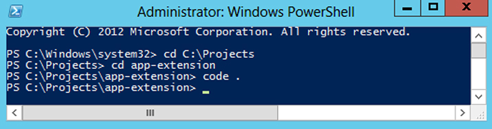
Create an Extension Project
- Run Windows Powershell as administrator and create a new project directory named “app-extension” in your preferred location using below command.
md app-extension
- Move to the newly created project directory using the below command.
cd app-extension
- Create a new AppCustomizer extension by running below command in console
yo @microsoft/sharepoint
Provide required information when prompted:
- Keep the default app-extension for “What is your solution name?” and select Enter.
- Keep SharePoint Online only (latest) for “Which baseline packages do you want to target for your component(s)?” and select Enter.
- Keep Use the current folder for “Where do you want to place the files?” and select Enter.
- Select No (N) to require the tenant admin install extension on each site and press Enter. Here, make sure you select No (N). If you choose Yes (y), Elements.xml feature deployment file will not be generated through scaffolding.
- Choose Extension for “Which type of client-side component to create?” (Use arrow keys)
- Select Application Customizer as extension type from the list of available options.
- As soon as you select Application Customizer, the next group of prompts asks for information regarding your extension.
- Add AppCustomizer as your extension name, and press Enter.
- Keep the default AppCustomizer description for “What is your Application Customizer description?” and select Enter.
Note: You might encounter some issues if your extension name is too long. The name entries generates an alias for App Customizer manifest file. In case where alias passes 40 characters, it will throw an exception when you try to run gulp serve –nobrowser command. It can be resolved by updating the alias entry later on.
At this moment, Yeoman installs the needed dependencies and scaffolds the solution files along with the AppCustomizer extension. This may take some time.
When scaffolding is done, you will be indicated a successful scaffold message.

- To start Visual Studio Code, type the following command
code .
Observe how the default structure of the solution looks like that for client-side web parts.

- Open AppCustomizerApplicationCustomizer.manifest.json in the src\extensions\appCustomizer folder.
This file contains extension type and a unique id for your extension.
AppCustomizerApplicationCustomizer.manifest.json
{ "$schema": "https://developer.microsoft.com/json-schemas/spfx/client-side-extension-manifest .schema.json", "id": "1cbcb2bd-1739-40d3-a250-e56615e3409a", "alias": "AppCustomizerApplicationCustomizer", "componentType": "Extension", "extensionType": "ApplicationCustomizer", "version": "*", "manifestVersion": 2, "requiresCustomScript": false } |
SharePoint Framework Application Customizer Code
- Open the AppCustomizerApplicationCustomizer.ts file in the src\extensions\appCustomizer folder.
- It imports the base class BaseApplicationCustomizer for the App Customizer from sp-application-base package which contains SharePoint framework code.
AppCustomizerApplicationCustomizer.ts
import { override } from '@microsoft/decorators';
import { Log } from '@microsoft/sp-core-library';
import {
         BaseApplicationCustomizer
       }
from '@microsoft/sp-application-base';
import { Dialog } from '@microsoft/sp-dialog';
- onInit method contains the logic for your Application Customizer, which is
called when the extension is first activated. - Below is the default solution having contents of onInit() method.
It writes a log and displays an alert when the page is loaded.AppCustomizerApplicationCustomizer.ts
@override
  public async onInit(): Promise {
    Log.info(LOG_SOURCE, `Initialized ${strings.Title}`);

    let message: string = this.properties.testMessage;
    if(!message){
        message = '(No properties were provided.)';
    }

    Dialog.alert(`Hello from $(strings.Title):\n\n${message}`);

    return Promise.resolve();
}
Debug Application Customizer
Local Workbench cannot be used to test SharePoint Framework Extensions. You can test extensions using SharePoint Online site. However, you do not need to deploy your customization to the site.
- Open up the serve.json file from inside the config folder.
This file has been modified based on your project default settings. You can observe that the customActions element mentions a unique GUID. When a project is scaffold, it is automatically updated. Whenever you require to add new components or modify specific properties, you will need to edit this file for testing purposes.
- Edit pageURL for your tenant, which you need to utilize for testing. You can use your preferred page URL having modern experience
For example – A welcome page or custom page of a modern team site or a publishing site, something like below URL:
Note: In case of a custom page, a modern site page with the above URL should have been created in your site.
- Below is updated serve.json file containing your tenant details:
serve.json
{
  "$schema": "https://developer.microsoft.com/json-schemas/core-build/serve.schema.json",
  "port": 4321,
  "https": true,
  "serveConfigurations": {
    "default": {
      "pageUrl": "https://domain-name/sites/dev/SitePages/AppCustomizer.aspx",
      "customActions": {
        "1cbcb2bd-1739-40d3-a250-e56615e3409a": {
          "location": "ClientSideExtension.ApplicationCustomizer",
          "properties": {
            "testMessage": "Test message"
          }
        }
      }
    },
    "appCustomizer": {
      "pageUrl": " https://domain-name/sites/dev/SitePages/AppCustomizer.aspx ",
      "customActions": {
        "1cbcb2bd-1739-40d3-a250-e56615e3409a": {
          "location": "ClientSideExtension.ApplicationCustomizer",
          "properties": {
           "testMessage": "Test message"
          }
        }
      }
    }
  }
}
- In your console, make sure that you are still in the app-extension directory. Enter below command:
gulp trust-dev-cert
Note: Above command needs to be executed ONLY once in your development environment. Skip this step if you have already installed a certificate in your environment by executing this command.
- Run below command to compile your code from your local computer/virtual machine:
gulp serve
Note: Stop the compilation running currently by executing Ctrl + C command in the console if Workbench notifies that you, being a SharePoint developer, do not have SPFx developer certificate installed and you cannot load scripts from localhost. Execute gulp serve –nobrowser command in the app-extension directory again.
When code compilation is completed without any issues, it opens the resulting manifest from localhost in your default browser with required query parameters.
- Navigate to your default browser and click Load debug scripts to proceed loading scripts from your local host.
Below dialog message will now appear on your page.

SharePoint Framework Extensions throws the above dialog. textMessage property was provided as part of the query parameters and that is why it is included in the alert. You can specify your own extension instances which are part of query parameters at runtime.
Note: In case of any errors, verify the pageUrl setting in the server.json file.
You successfully got your first SharePoint Framework Extension up and running!
You will use the same project directory and utilize content placeholders for customizing the UI of SharePoint. Note that gulp serve command is currently running.
In your console window or in your editor, notice that the gulp serve command is still running. You can let it run for now.
Use Page Placeholders From Application Customizer
Application Customizers provide access to SharePoint page components that you can customize based on your business needs. For an instance, you can use SharePoint Framework application customizer to render a custom header and footer experience of SharePoint sites.
This model complements SharePoint Hosted add-in that includes a UserCustomAction collection to render custom header and footer through JavaScript and configuration interface. The key difference here is that SharePoint Framework (SPFx) Extensions won’t change your page elements even if the HTML/DOM structure is changed.
Get Access to Page Placeholders
You can specify the scope (Site, Web or List) to decide where to register Application Customizer in your tenant app catalog site.
To get access to the placeholder, use the below method.
Get access to the placeholder
// Handling the Bottom placeholder if (!this._bottomPlaceholder) { this._bottomPlaceholder = this.context.placeholderProvider.tryCreateContent( PlaceholderName.Bottom, { onDispose: this._onDispose }); ... } |
You have full access over what to render to the user once you fetch the placeholder object.
Here you are accessing a familiar placeholder by using respective identifier i.e. the code accesses footer inside the page using Bottom identifier.
Modify Application Customizer to Access and Modify Placeholders
- You will need to install @microsoft/sp-office-ui-fabric-core to render placeholders on the page by importing styles from SPFabricCore.scss.
- Run Windows Powershell as administrator and enter the following command for your extension location to install @microsoft/sp-office-ui-fabric-core:
npm install @microsoft/sp-office-ui-fabric-core
- Upload required image for header which you would like to use in Site Assets library (or any other location). Keep a note of the image location URL which you will later.
- Under the src\extensions\appCustomizer folder, create a new file AppCustomizer.module.scss as shown below.
- Update AppCustomizer.module.scss with styles used in the HTML output for image as well as header and footer placeholders:
AppCustomizer.module.scss
.app {
    .top {
        text-align:center;
        line-height:2.5;
        font-weight:bold;
        display: flex;
        align-items: top;
        justify-content: top;
        background-color: #3a3c3f;
        color: $ms-color-white;
        padding: 10px;

        IMG {
            max-width: 100%;
            height: auto;
        }
    }

    .bottom {
        height:40px;
        text-align:center;
        line-height:2.5;
        font-weight:bold;
        display: flex;
        align-items: center;
        justify-content: center;
        background: #111111;
        color: $ms-color-white;
    }
}
- Open src\extensions\appCustomizer\AppCustomizerApplicationCustomizer.ts in your code editor.
- Import PlaceholderContent and PlaceholderName from @microsoft/sp-application-base library by adding below lines:
AppCustomizerApplicationCustomizer.ts
import {
  BaseApplicationCustomizer,
  PlaceholderContent,
  PlaceholderName
} from '@microsoft/sp-application-base';
- After strings import at the top, add below import statements.
AppCustomizerApplicationCustomizer.ts
import * as strings from 'AppCustomizerApplicationCustomizerStrings';
import styles from './AppCustomizer.module.scss';
import { escape } from '@microsoft/sp-lodash-subset';
- You use escape to escape App Customizer properties. You’ll define styles for the render in the following steps.
- Modify IAppCustomizerApplicationCustomizerProperties interface to add required properties for Header, Logo and Footer in AppCustomizerApplicationCustomizer.ts file, as follows.
AppCustomizerApplicationCustomizer.ts
export interface IAppCustomizerApplicationCustomizerProperties {
  // This is an example; replace with your own property
  Top: string;
  Bottom: string;
  Logo: string;
}
- Note: If your Command Set uses the ClientSideComponentProperties JSON input, it is deserialized into the BaseExtension.properties object. You can define an interface to describe it.
- In the AppCustomizerApplicationCustomizer class, add below private variables. In this case, variables can be defined locally in onRender method, though if you require to share them with other objects, define the variables as private.
AppCustomizerApplicationCustomizer.ts
/** A Custom Action which can be run during execution of a client Side Application */
export default class AppCustomizer ApplicationCustomizer
	extends BaseApplicationCustomizer {

	// These have been added
	private _topPlaceholder: PlaceholderContent | undefined;
	private _bottomPlaceholder: PlaceholderContent | undefined;
- Modify onInit method as shown below:
AppCustomizerApplicationCustomizer.ts
private _renderPlaceHolders(): void {
        console.log("HelloWorldApplicationCustomizer._renderPlaceHolders()");
        console.log(
            "Available placeholders: ",
            this.context.placeholderProvider.placeholderNames
                .map(name => PlaceholderName[name])
                .join(", ")
        );

        // Handling the top placeholder
        if (!this._topPlaceholder) {
            this._topPlaceholder = this.context.placeholderProvider.tryCreateContent(
                PlaceholderName.Top,
                { onDispose: this._onDispose }
            );

            // The extension should not assume that the expected placeholder is available.
            if (!this._topPlaceholder) {
                console.error("The expected placeholder (Top) was not found.");
                return;
            }

            if (this.properties) {
                let topString: string = this.properties.Top;
                if (!topString) {
                    topString = "(Top property was not defined.)";
                }

                if (this._topPlaceholder.domElement) {
                    this._topPlaceholder.domElement.innerHTML = ``; }
                }
        }

        // Handling the bottom placeholder
        if (!this._bottomPlaceholder) {
        	this._bottomPlaceholder = this.context.placeholderProvider.tryCreateContent
        	( PlaceholderName.Bottom, { onDispose: this._onDispose } );
        	// The extension should not assume that the expected placeholder is available. if (!this._bottomPlaceholder)
        	{
        		console.error("The expected placeholder (Bottom) was not found.");
        		return;
        	}
        	if (this.properties)
        		{
        			let bottomString: string = this.properties.Bottom;
        			if (!bottomString)
        				{
        					bottomString = "(Bottom property was not defined.)";
        				}
        			if (this._bottomPlaceholder.domElement)
        			{ this._bottomPlaceholder.domElement.innerHTML = ``; }
        		}
        	}
        }
- You will need to create _renderPlaceHolders private method and add below code inside it:
private _renderPlaceHolders(): void {
	console.log("AppCustomizerApplicationCustomizer._renderPlaceHolders()");
	console.log(
		"Available placeholders: ",
		this.context.placeholder Provider.placeholderNames
			.map (name => PlaceholderName [name])
			.join("")
	);

	// Handling the top placeholder
	if (!this._topPlaceholder) {
		this._topPlaceholder = this.context.placeholder Provider.tryCreateContent
			PlaceholderName. Top,
			{ onDispose: this._onDispose }
		);

		// The extension should not assume that the expected placeholder is available.
		if (!this._topPlaceholder) {
			console.error ("The expected placeholder (Top) was not found.");
			return;
		}

		if (this.properties) {
			let topString: string = this.properties. Top;
			if (!topString) {
				topString = "(Top property was not defined.)";
			}

			let logoString: string = this.properties. Logo;
			if (!logoString) {
				console.error('Logo URL was not defined.');
			}

			if (this._topPlaceholder.domElement) {
				this._topPlaceholder.domElement.innerHTML =
				}
		}
	}
	// Handling the bottom placeholder
	if (!this._bottomPlaceholder) {
		this._bottomPlaceholder = this.context.placeholder Provider. tryCreateContent
			PlaceholderName. Bottom,
			{ onDispose: this._onDispose }
		);

		// The extension should not assume that the expected placeholder is available.
		if (!this._bottomPlaceholder) {
			console.error ("The expected placeholder (Bottom) was not found.");
			return;
		}

		if (this.properties) {
			let bottomString: string = this.properties. Bottom;
			if (!bottomString) {
				bottomString = "(Bottom property was not defined.)";
			}

			if (this._bottomPlaceholder.domElement) {
				this._bottomPlaceholder.domElement.innerHTML
				${escape( bottomString )
			}
	}
}
- Add _onDispose method as shown below after completion of _renderPlaceHolders method. You can output below console message on removal of extension from the page.
AppCustomizerApplicationCustomizer.ts
private _onDispose(): void {
    console.log('[AppCustomizerApplicationCustomizer._onDispose] Disposed custom top
    and bottom placeholders.');
  }
You are now able to test the customizer in SharePoint Online.
Test Your Code
- Navigate to serve.json file inside the config folder and adjust the settings as we defined three new properties for the extension. Modify properties section to include Top, Bottom and Logo messages.
serve.json
{
  "$schema": "https://developer.microsoft.com/json-schemas/core-build/serve.schema.json",
  "port": 4321,
  "https": true,
  "serveConfigurations": {
    "default": {
      "pageUrl": "https://domain-name/sites/dev/SitePages/AppCustomizer.aspx",
      "customActions": {
        "1cbcb2bd-1739-40d3-a250-e56615e3409a": {
          "location": "ClientSideExtension.ApplicationCustomizer",
          "properties": {
            "Top":"TatvaSoft",
            "Bottom":"© TatvaSoft 2018 | Privacy Policy",
            "Logo":"https://domain-name/sites/dev/SiteAssets/TatvaSoft-Software-Development-Company.png"
          }
        }
      }
    },
    "appCustomizer": {
      "pageUrl": "https://domain-name/sites/dev/SitePages/AppCustomizer.aspx",
      "customActions": {
        "1cbcb2bd-1739-40d3-a250-e56615e3409a": {
          "location": "ClientSideExtension.ApplicationCustomizer",
          "properties": {
            "Top":"TatvaSoft",
            "Bottom":"© TatvaSoft 2018 | Privacy Policy",
            "Logo":"https://domain-name/sites/dev/SiteAssets/TatvaSoft-Software-Development-Company.png"
          }
        }
      }
    }
  }
}
- Check for any errors in the console window that is executing gulp serve. If gulp reports any error, you need to fix the issues before proceeding further. Restart the solution if already running to apply updated changes inside serve.json file.
gulp serve
- To continue loading scripts from localhost, click Load debug scripts.
You will now see custom header (with logo) and footer content.

Using Application Customizer, you have successfully built your own custom header and footer!
Follow below steps to continue building extension and deploy, and preview App Customizer extension without using Debug query parameters in SharePoint site collection.
Deploy Your Extension to SharePoint
SharePoint Framework extensions can be deployed and activated on SharePoint d in a few different ways. It depends on your business needs in order to select the right model.
- Activation of feature on specific site when solution is installed. It supports site placeholders and assets getting created and deployed through feature activation.
- Use PowerShell or APIs as part of tenant-scoped deployment option.
- Tenant wide deployment from app catalog.
Package the App Customizer Application Customizer
We will use Feature Framework based activation as we need to activate extensions in a single site.
- Navigate to the app-extension project directory created.
cd app-extension
- Stop gulp serve from running in the console by selecting Ctrl + C.
- You will need to deploy and register the extension with SharePoint in Site collection, Site, or List scope. Here, we’ll register the Application Customizer in Site collection scope.
- Move to your solution package in Visual Studio Code.
- Expand the sharepoint folder and then assets subfolder to open elements.xml file.
Review the Existing elements.xml File For SharePoint Definitions
- Observe the relevant XML structure in file (sharerpoint\assets\elements.xml). Note that the ClientSideComponentId property is modified automatically based on the unique ID of your Application Customizer available in the AppCustomizerApplicationCustomizer.manifest.json file in the src\extensions\appCustomizer folder.
- ClientSideExtension.ApplicationCustomizer specifies that this is an Application Customizer.
- Update the ClientSideComponentProperties as below to match updates in the Application Customizer.
Elements.xml
<!--?xml version="1.0" encoding="utf-8"?-->
Note: Do not copy the whole structure as it would mismatch your original ClientSideComponentId.
Ensure that Definitions are Taken Into Account Within the Build Pipeline
- Navigate to config folder > package-solution.json file
- Delete entry for clientsideinstance.xml under elementManifests.
- Initial elementManifests section:
package-solution.json
"assets": {
    "elementManifests": [
        "elements.xml",
        "clientsideinstance.xml"
    ]
- Updated elementManifests section:
package-solution.json
"assets": {
          "elementManifests": [
            "elements.xml"
          ]
- Your package-solution.json file will look like below after needed edits.
package-solution.json
{
  "$schema": "https://developer.microsoft.com/json-schemas/spfx-build/package-solution.schema.json",
  "solution": {
    "name": "app-extension-client-side-solution",
    "id": "9ffbad8c-8fee-4559-ae9b-dc086bba2633",
    "version": "1.0.0.0",
    "includeClientSideAssets": true,
    "features": [
      {
        "title": "Application Extension - Deployment of custom action.",
        "description": "Deploys a custom action with ClientSideComponentId association",
        "id": "7b70e17d-2547-4ae4-bb90-a6ca1fce0827",
        "version": "1.0.0.0",
        "assets": {
          "elementManifests": [
            "elements.xml"
          ]
        }
      }
    ]
  },
  "paths": {
    "zippedPackage": "solution/app-extension.sppkg"
  }
}
Deploy the Extension to SharePoint Online
You can now deploy the solution to the SharePoint site.
- Execute below command to package solution to get basic structure ready for packaging:
gulp bundle
- Run below Command to create solution package:
gulp package-solution - Above command creates a package named app-extension.sppkg in the sharepoint > solution folder.
- To deploy the package, navigate to the app catalog and open the Apps for SharePoint library.
- Upload/drag and drop the app-extension.sppkg to Apps for SharePoint library inside App Catalog.
- SharePoint displays a dialog and asks you to trust the client-side solution. Click the Deploy button.
- From the console, execute below command in the solution folder:
gulp serve –nobrowser
- Navigate to the site collection where you deployed the extension.
- Click the Settings gear from the right hand side, and then select Add an app.
- Enter app inside the search box to filter your apps.
- Choose the app-extension-client-side-solution app from the list of available options to install the solution. Refresh the page when the installation is done.
- When the application has been successfully installed, you can see the header and footer being rendered just like with the debug query parameters.
You have successfully deployed an extension to a modern SharePoint page using app catalog!
- You can deploy and load the extension assets from Office CDN instead of localhost.
Top Navigation From Managed Metadata Using SharePoint Framework
Below is an example where you can use managed metadata to derive global navigation terms within SharePoint Framework extension.
- Stop the compilation running in the console by executing Ctrl + C command.
- Open app-extension solution inside Visual Studio Code (or one of your preferred editors).
code
- Create a services subfolder inside the src/extensions/appCustomizer folder.
- Create a file named SPTermStoreService.ts inside the newly created services folder.
- Copy code inside SPTermStoreService.ts file from file from this link:
It is used to connect to SharePoint web service (client.svc) and get term set from managed term store. - Create a new components subfolder inside the src/extensions/appCustomizer folder.
- Add below code inside IGlobalNavBarProps.ts file.
IGlobalNavBarProps.ts
import * as SPTermStore from './../services/SPTermStoreService';

export interface IGlobalNavBarProps {
    menuItems: SPTermStore.ISPTermObject[];
}
- Add below code inside IGlobalNavBarState.ts file.
IGlobalNavBarState.ts
export interface IGlobalNavBarState {
    // So far, it is empty
}
- Update AppCustomizer.module.scss file to include below changes:
AppCustomizer.module.scss
@import '~@microsoft/sp-office-ui-fabric-core/dist/sass/SPFabricCore.scss';

  .app {
    .top {
        text-align:center;
        line-height:2.5;
        font-weight:bold;
        display: flex;
        align-items: top;
        justify-content: top;
        background-color: #3a3c3f;
        color: $ms-color-white;
        padding: 10px;

        IMG {
            max-width: 100%;
            height: auto;
            margin-left: 20%;
        }
    }

    .bottom {
        height:40px;
        text-align:center;
        line-height:2.5;
        font-weight:bold;
        display: flex;
        align-items: center;
        justify-content: center;
        background: #111111;
        color: $ms-color-white;
    }

    .commandBar {
        width: 50%;
    	margin-top: 50px;
        background: none;
    }

    :global .ms-CommandBarItem-commandText, :global .ms-CommandBarItem-chevronDown{
        color: $ms-color-white !important;
    }

    :global .ms-CommandBarItem-link:hover{
        background-color: #2a2b2c!important;
    }

    a {
        text-decoration: none;
        color: white;
        padding-left: 10px;
        padding-right: 10px;
      }
  }
- Also update AppCustomizer.module.scss.ts file as shown below:
AppCustomizer.module.scss.ts
/* tslint:disable */
require('./AppCustomizer.module.css');
const styles = {
  app: 'app_9daf7503',
  top: 'top_9daf7503',
  bottom: 'bottom_9daf7503',
  commandBar: 'commandBar_9daf7503',
};

export default styles;
/* tslint:enable */
- Install npm package to your project using below command:
npm install sp-pnp-js –save
install npm package
Note: Please ensure you have full rights before executing above command.
- Update AppCustomizerApplicationCustomizer.ts to add/update below code.
AppCustomizerApplicationCustomizer.ts
import * as React from 'react';
import * as ReactDom from 'react-dom';
import { override } from '@microsoft/decorators';
import { Log } from '@microsoft/sp-core-library';
import {
  BaseApplicationCustomizer,
  PlaceholderContent,
  PlaceholderName
} from '@microsoft/sp-application-base';
import { Dialog } from '@microsoft/sp-dialog';

import * as strings from 'AppCustomizerApplicationCustomizerStrings';
import styles from './AppCustomizer.module.scss';
import { escape } from '@microsoft/sp-lodash-subset';

import GlobalNavBar from './components/GlobalNavBar';
import { IGlobalNavBarProps } from './components/IGlobalNavBarProps';
import * as SPTermStore from './services/SPTermStoreService';
import pnp from "sp-pnp-js";

const LOG_SOURCE: string = 'AppCustomizerApplicationCustomizer';
const NAV_TERMS_KEY: string = 'global-navigation-terms';

/**
 * If your command set uses the ClientSideComponentProperties JSON input,
 * it will be deserialized into the BaseExtension.properties object.
 * You can define an interface to describe it.
 */
export interface IAppCustomizerApplicationCustomizerProperties {
  // This is an example; replace with your own property
  Top: string;
  Bottom: string;
  Logo: string;
  TopMenuTermSet?: string;
}

/** A Custom Action which can be run during execution of a Client Side Application */
export default class AppCustomizerApplicationCustomizer
  extends BaseApplicationCustomizer {

  // These have been added
  private _topPlaceholder: PlaceholderContent | undefined;
  private _bottomPlaceholder: PlaceholderContent | undefined;
  private _topMenuItems: SPTermStore.ISPTermObject[];

  @override
  public async onInit(): Promise {
    Log.info(LOG_SOURCE, `Initialized ${strings.Title}`);

    // Added to handle possible changes on the existence of placeholders.
    // this.context.placeholderProvider.changedEvent.add(this, this._renderPlaceHolders);

    // Configure caching
    pnp.setup({
        defaultCachingStore: "session",
        defaultCachingTimeoutSeconds: 900, //15min
        globalCacheDisable: false // true to disable caching in case of debugging/testing
    });

    // Retrieve the menu items from taxonomy
    let termStoreService: SPTermStore.SPTermStoreService = new SPTermStore.SPTermStoreService({
        spHttpClient: this.context.spHttpClient,
        siteAbsoluteUrl: this.context.pageContext.web.absoluteUrl,
    });

    if (this.properties.TopMenuTermSet != null) {
        let cachedTerms = pnp.storage.session.get(NAV_TERMS_KEY);
        if(cachedTerms != null){
            this._topMenuItems = cachedTerms;
        }
        else {
            this._topMenuItems = await termStoreService.getTermsFromTermSetAsync(this.properties.TopMenuTermSet, this.context.pageContext.web.language);
            pnp.storage.session.put(NAV_TERMS_KEY,this._topMenuItems);
        }
    }

    // Call render method for generating the HTML elements.
      this._renderPlaceHolders();
      return Promise.resolve();
  }

  private _renderPlaceHolders(): void {
    console.log("AppCustomizerApplicationCustomizer._renderPlaceHolders()");
    console.log(
        "Available placeholders: ",
        this.context.placeholderProvider.placeholderNames
            .map(name => PlaceholderName[name])
            .join(", ")
    );

    // Handling the top placeholder
    if (!this._topPlaceholder) {
        this._topPlaceholder =
          this.context.placeholderProvider.tryCreateContent(
            PlaceholderName.Top,
            { onDispose: this._onDispose });

        // The extension should not assume that the expected placeholder is available.
        if (!this._topPlaceholder) {
          console.error('The expected placeholder (Top) was not found.');
          return;
        }

        if (this._topMenuItems != null && this._topMenuItems.length > 0) {
          const element: React.ReactElement = React.createElement(
            GlobalNavBar,
            {
              menuItems: this._topMenuItems,
            }
          );

          ReactDom.render(element, this._topPlaceholder.domElement);
        }
    }

    // Handling the bottom placeholder
    if (!this._bottomPlaceholder) {
        this._bottomPlaceholder = this.context.placeholderProvider.tryCreateContent(
            PlaceholderName.Bottom,
            { onDispose: this._onDispose }
        );

        // The extension should not assume that the expected placeholder is available.
        if (!this._bottomPlaceholder) {
            console.error("The expected placeholder (Bottom) was not found.");
            return;
        }

        if (this.properties) {
            let bottomString: string = this.properties.Bottom;
            if (!bottomString) {
                bottomString = "(Bottom property was not defined.)";
            }

            if (this._bottomPlaceholder.domElement) {
                this._bottomPlaceholder.domElement.innerHTML = `


${escape(bottomString)}


`;
            }
        }
    }
  }

  private _onDispose(): void {
    console.log('[AppCustomizerApplicationCustomizer._onDispose] Disposed custom top and bottom placeholders.');
  }
}
- Navigate to serve.json file inside the config folder and adjust the settings as we have defined a new property for the extension.
serve.json
{
  "$schema": "https://developer.microsoft.com/json-schemas/core-build/serve.schema.json",
  "port": 4321,
  "https": true,
  "serveConfigurations": {
    "default": {
      "pageUrl": "https://domain-name/sites/dev/SitePages/AppCustomizer.aspx",
      "customActions": {
        "1cbcb2bd-1739-40d3-a250-e56615e3409a": {
          "location": "ClientSideExtension.ApplicationCustomizer",
          "properties": {
            "TopMenuTermSet":"GlobalNavBar",
            "Top":"TatvaSoft",
            "Bottom":"© TatvaSoft 2018 | Privacy Policy",
            "Logo":"https://domain-name/sites/dev/SiteAssets/TatvaSoft-Software-Development-Company.png"
          }
        }
      }
    },
    "appCustomizer": {
      "pageUrl": "https://domain-name/sites/dev/SitePages/AppCustomizer.aspx",
      "customActions": {
        "1cbcb2bd-1739-40d3-a250-e56615e3409a": {
          "location": "ClientSideExtension.ApplicationCustomizer",
          "properties": {
            "TopMenuTermSet":"GlobalNavBar",
            "Top":"TatvaSoft",
            "Bottom":"© TatvaSoft 2018 | Privacy Policy",
            "Logo":"https://domain-name/sites/dev/SiteAssets/TatvaSoft-Software-Development-Company.png"
          }
        }
      }
    }
  }
}
- Update sharepoint/assets/elements.xml with below code.
elements.xml
<br><br> <br> <br><br>
- In order to configure managed metadata terms in your modern site, navigate to term store management page.
- Create a new term group “Navigation” and configure term set named “GlobalNavBar” under it.
- Configure required terms under newly created “GlobalNavBar” terms set.
- Run gulp serve command inside the console to preview and debug the solution.
- Observe that you have below debug query parameters appended at the end of your site page URL once you Load debug scripts.
?debugManifestsFile=https%3A%2F%2Flocalhost%3A4321%2Ftemp%2Fmanifests.js&loadSPFX=true&customActions=%7B"1cbcb2bd-1739-40d3-a250-e56615e3409a"%3A%7B"location"%3A"ClientSideExtension.ApplicationCustomizer"%2C"properties"%3A%7B"TopMenuTermSet"%3A"GlobalNavBar"%2C"Top"%3A"TatvaSoft"%2C"Bottom"%3A"©%20TatvaSoft%202018%20%7C%20Privacy%20Policy"%2C"Logo"%3A"https%3A%2F%2Fdomain-name%2Fsites%2Fdev%2FSiteAssets%2FTatvaSoft-Software-Development-Company.png"%7D%7D%7D
- Package and Deploy the extension to your preferred SharePoint site collection.
- Once you deploy extension, you will see custom header, global navigation and footer in your modern site.
- Below is a modern communication site with custom header, top navigation and footer:
- Below depicts same header, navigation and footer in a Modern Team Site.
- With SPFx solutions, it is possible to customize the facets of SharePoint experience that includes notifications, toolbars and list data views. With all Office 365 subscription packages, SPFx is available.

Vishal Shah
Vishal Shah has an extensive understanding of multiple application development frameworks and holds an upper hand with newer trends in order to strive and thrive in the dynamic market. He has nurtured his managerial growth in both technical and business aspects and gives his expertise through his blog posts.
Want to Hire Skilled Developers?
 Best Practices")


Comments
Leave a message...