Related Blogs
What is Power BI?
Power BI is a collection of hundreds of connectors that work together to turn the unrelated sources of data into coherent, attractive and interactive insights. It converts your data from different data sources to interactive dashboards and attractive reports. Power BI provides services – Power BI desktop, services based on SaaS, hundreds of connectors and Power BI mobile apps for different platforms. Whether your data is stored in an Excel workbook or stored in SQL servers or in a collection of cloud-based plus on-premises hybrid warehouses, Power BI allows you to connect different data sources, convert it to meaningful insights and share that with anyone. Power BI also provides custom development which means it can be your personal report as well as a visualization tool. Power BI is a collection of desktop application called Power BI desktop, an online Software as a Service called Power BI services and Power BI Mobile apps that are available on all mobile devices – Android, iOS and Windows. These three elements namely – Desktop, the Service and Mobile apps let SharePoint developers to create, share and consume business insights to boost the productivity of clients’ organization. The common stream of activity in Power BI looks like this –
- Attach data source to Power BI and create report
- Create new visualization and extensive dashboards after publishing report to Power BI service
- Share reports and dashboards to other people
- View and interact with shared reports and dashboards using Power BI mobile apps
Basic Elements of Power BI
Any complex requirements can be built by using basic elements. Any tasks can be performed by breaking down Microsoft Power BI into chunk of basic elements. By understanding the concepts of each Power BI elements, you are able to create any type of complex reports. Here are the basic elements of Power BI:
- Visualizations
- Datasets
- Reports
- Dashboards
- Tiles
1. Visualizations
Visualization is a visual representation of data like color coded maps, charts or other interesting things that gives more idea of statistics without drifting under large amount data. Power BI has many types of visualizations which are used by its user to create visually attractive report.

Visualizations can be as complex as colour gradient maps or different types of graphs and can be as simple as charts. The main objective to prefer a visual representation is to present data in a way that provides context and insights which would be otherwise very difficult to represent without any type of such creative visual effects.
2. Datasets
A Dataset is a collection of data that is used to generate reports and charts in Power BI. It is as simple as Microsoft Excel workbooks, SQL server database and other services like Facebook, Salesforce, or any of the various cloud databases available in the market. Power BI supports various data connectors to connect with data.
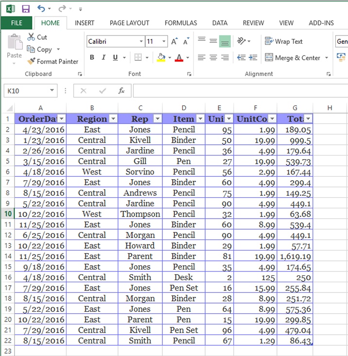
Power BI supports the combination of different data sources to act as a single dataset which is to be used for reports and charts. For example, you can create a dataset by combining 3 fields from Excel Workbook, 2 database tables from Oracle Database and online results of an email marketing campaign.
3. Reports
A Report is a collection of visual elements that appear together in one page or more pages. Following image shows a report in Power BI desktop – in this case, you can see there are five pages in report and currently, first page is visible.
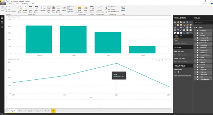
Power BI allows you to create report with single page or multiple pages to let you arrange your visuals in whatever way.
4. Dashboards
A dashboard is a collection of visual elements on a single page. It must fit on a single page and is often also called as a Canvas. You can share your dashboards to other users who can interact with it using Power BI service and mobile apps. In below image, you can see user has added number of diagrams and charts according to his needs.

5. Tiles
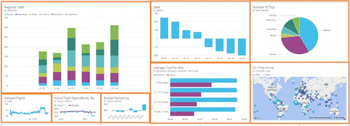
A tile is a single visual element on a report or a dashboard. It is a rectangular box on the page which holds one visual element. It can be re-sizable according to user’s need. You can see different sizes of tiles covered with orange colour border in below screenshot.
Using Power BI, you can create compelling data dashboards from the raw data. Visualizations are very helpful to get insights from the data. Using Power BI, you connect the SharePoint lists to generate various visualizations and share them among the users. Most of the Fortune 500 companies are using SharePoint Online development to manage their data. They require some tool which can execute these tons of data and convert them into visually attractive charts and graphs. They require these charts and dashboards to be shared with other users to grow their business. Hoping you are now knowing about the overview of Power BI and Why and for What it is used, now moving ahead know about how to implement Power BI.
Let’s start by creating a new report in Power BI with SharePoint list.
Creating a Report in Power BI Desktop with SharePoint List
- Download Power BI desktop setup file from URL: https://powerbi.microsoft.com/en-us/desktop/
- Install it in your computer
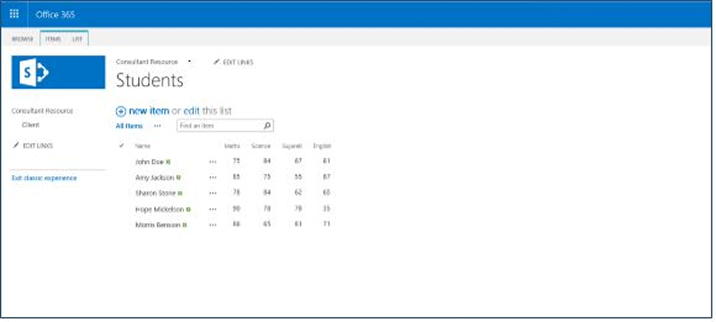
- You will require one SharePoint list created in SharePoint Online. Here, I have created one custom list with name “Students”.
- Open Power BI desktop application.
- It will ask to sign in using Power BI account.
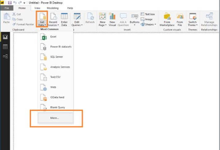
- Click “Get Data” in “Home” ribbon > click on “More…”
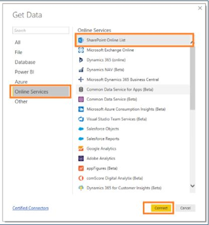
- Click “Online Services” > click “SharePoint Online List > click “Connect” button.
- It will ask for “Site URL”. Enter the SharePoint site URL.
- It will ask for authentication type to connect to site. Select “Microsoft account” > click “Sign In” button and pass the username and password to connect to site. Note: This prompt will come only if your SharePoint login and Power BI login
accounts are different. - It will show all lists and libraries from SharePoint site. Select “Students” list and click “Load” button.
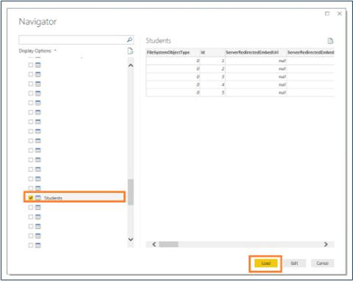
- It will load data from SharePoint list into Power BI.Report Tab (with list of columns):
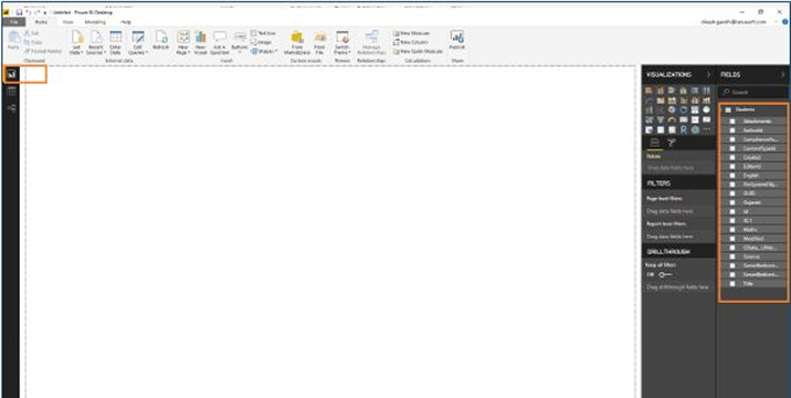
- Data Tab (with list of data):
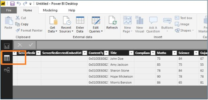
- Relationship Tab:
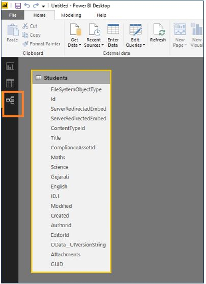
- In some cases, SharePoint list’s number type columns will appear as a string type. Convert them as a number type column to use them for creating charts.
- You can change column’s data types from Data Tab. Click column > Change data type from Modeling tab. hip Tab:
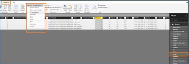
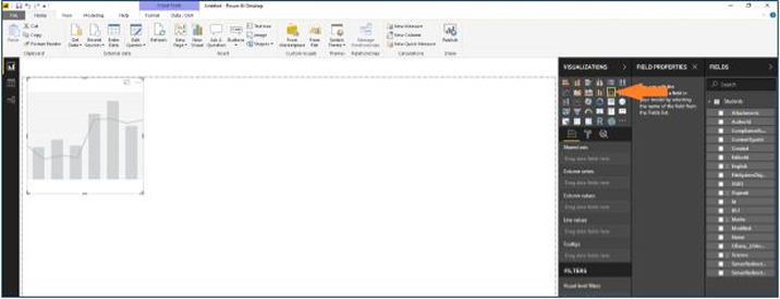
- Let’s create Line and clustered column chart. Select “Line and clustered column” chart from Visualizations tab.
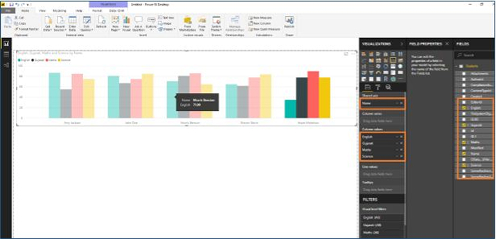
- Select columns “Name”, “English”, “Gujarati”, “Maths” and “Science” from Fields tab.
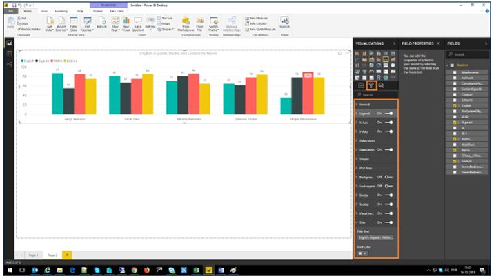
- You can change design Format for charts from Visualization tab.
Publish the Report in Power BI Service
- To publish the report, click “Publish” button in ribbon.

- It will ask for destination, select “My workspace” and click “Save” button.
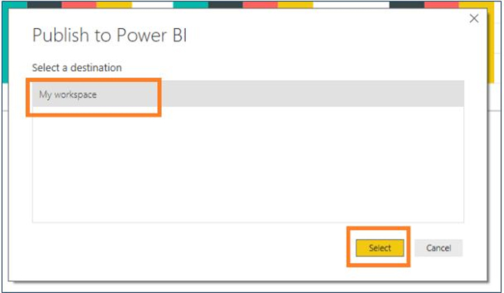
- It will upload the report in Power BI service cloud. Open URL: https://powerbi.microsoft.com/
- Login with your credentials.
- You can find your report under “My Workspace” and Reports tab.
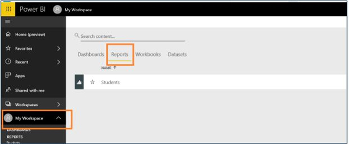
- Click Report to view the report.

Add this Report in SharePoint Online Page
In Modern UI Page
- Click “File” > click “Embed in SharePoint Online (Preview)” link.
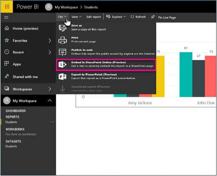
- Copy URL from dialog.

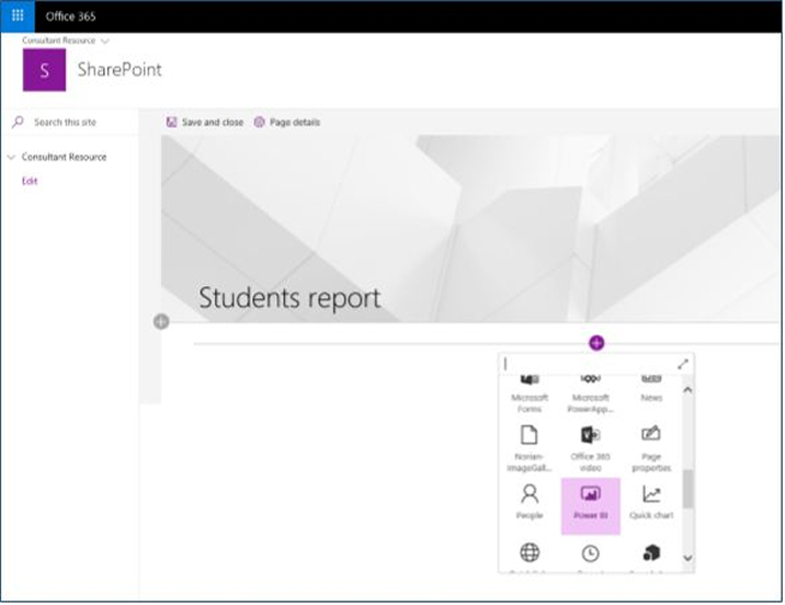
- Create new site page in “Site Pages” library in SharePoint Online site with modern UI experience.
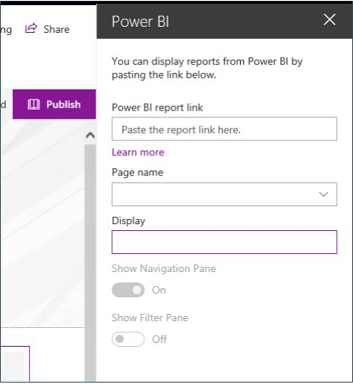
- Click “+” icon to add Power BI report as below. Click on “Power BI”.
- Click “Add Report” button to add the report URL.
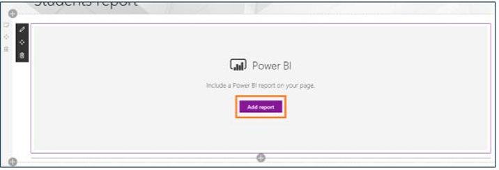
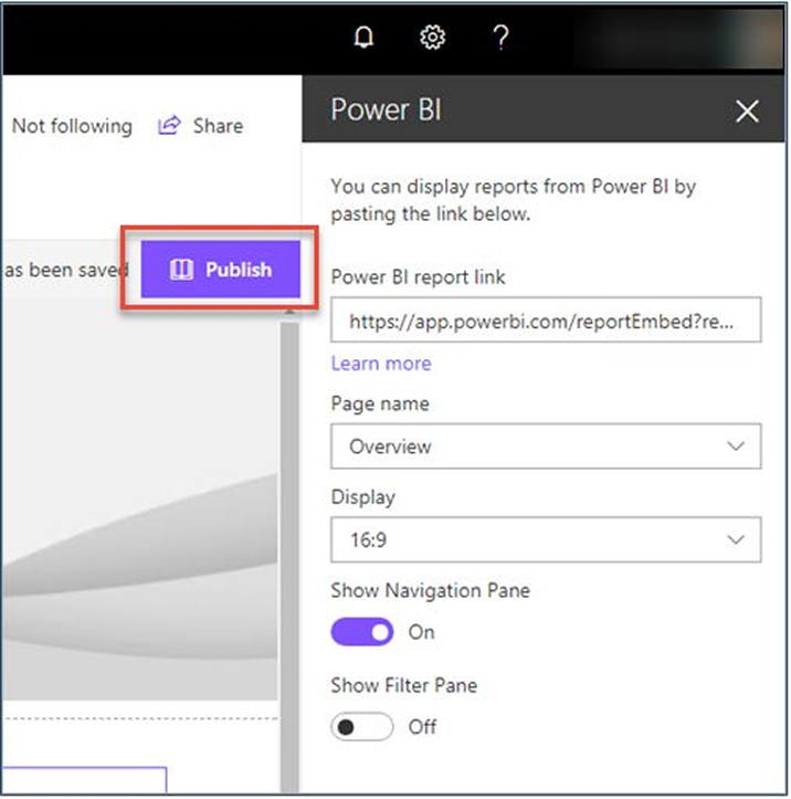
- Add URL into the property pane which you have copied in above steps.
- Select “Publish” to make changes visible to other users.
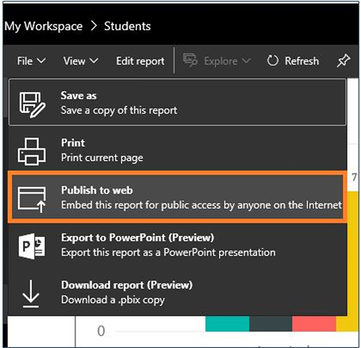
- In Classic UI Page Click “File” > click “Publish to web”.
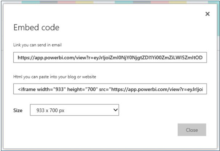
- Copy embedded code from dialog box.
- Create web part page in “Site Pages” library.
- Add content editor web part in web part page.
- Edit the content editor web part and add the paste the embedded code.
- Save the changes in page.
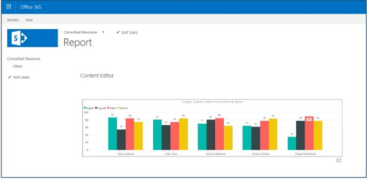
Configure Scheduled Refresh For Reports in Power BI Service
- Login to URL: https://powerbi.microsoft.com/
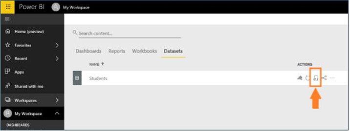
- Open “My Workspace” > click “Datasets” tab.

- Click “Schedule refresh” icon under “Actions”.
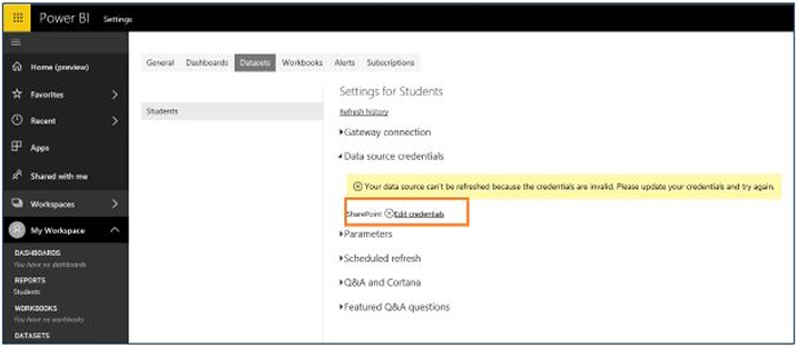
- Click “Edit Credentials” to update the credentials for data source. Note: Pass the credentials which can access the custom list from SharePoint Online site.
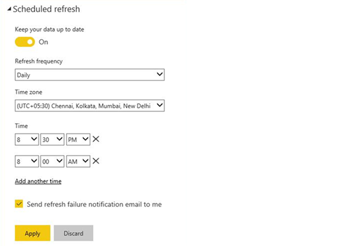
- Open “Scheduled refresh” tab > enable “Keep data up to date”.
- Set refresh frequency to whether “Daily” or “Weekly” according to your need.
- Set “Time zone”.
- You can set multiple hours and minutes (00 & 30 minutes) to refresh the data.
- Click “Apply” button to save the configuration.
- Data changes will be reflected in chart once scheduled refresh will be executed.
Check Refresh History of Scheduled Refresh
- Open “Scheduled refresh” for dataset in Power BI using above steps.
- On the top, last refresh succeed and next refresh time will be displayed.
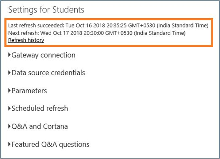
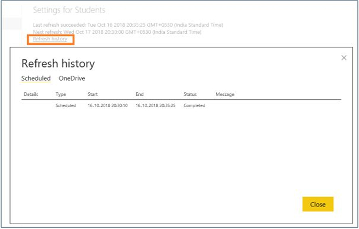
- Click “Refresh history” to open history logs for scheduled refresh time.
That’s how users can create reports and dashboards in Power BI using data from SharePoint lists and it is very helpful and easy to get insights from loads of data as it is providing interactive visualizations. As businesses are growing and their data is multiplying rapidly. It is not always necessary the available is in structured format, sometimes data may be scattered in various databases (in structured as well as unstructured format), and also it is possibility that data may be generated by using the solution developed in different-different technologies and tools. By using Power BI you can connect data with a large variety of connectors into one tool and create the reports in multiple graphical representation format. Compared to the functionalities offers, it is indeed very cost effective. Power BI is built with a cloud service with a view to share reports and dashboards with other users. It uses all modern HTML5 coding techniques to ensure compatibility with all rowers. It also provides industrial strength security wrapped around the cloud presence and is definitely secure. SharePoint consultants these days to effectively deal with massive data and generate reports and dashboards highly recommend to embrace Power BI implementation.

Vishal Shah
Vishal Shah has an extensive understanding of multiple application development frameworks and holds an upper hand with newer trends in order to strive and thrive in the dynamic market. He has nurtured his managerial growth in both technical and business aspects and gives his expertise through his blog posts.
Subscribe to our Newsletter
Signup for our newsletter and join 2700+ global business executives and technology experts to receive handpicked industry insights and latest news
Build your Team
Want to Hire Skilled Developers?





Comments
Leave a message...