If you’re building modern web interfaces with Vue.js and want to take advantage of Bootstrap’s responsive design, BootstrapVue is an excellent solution. It combines Vue’s flexibility with Bootstrap’s pre-styled components, helping you create clean, consistent, building user interfaces quickly. Regardless of whether you’re a beginner who wants to speed up front-end development or an experienced developer seeking to maintain a consistent app UI, BootstrapVue provides a robust toolkit to simplify your workflow.
In this comprehensive guide, we’ll explore what BootstrapVue is, why it’s a valuable tool for Vue.js development company, its key benefits, how to install it, and how to use its extensive range of components efficiently.
1. What is BootstrapVue?
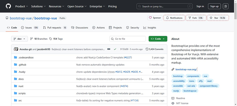
BootstrapVue is a UI component library that combines the design power of Bootstrap with the flexibility of Vue.js. It allows developers to use Bootstrap’s responsive layout system and pre-styled components directly within Vue applications, without relying on jQuery. With BootstrapVue, you get access to a wide range of reusable components such as modals, buttons, and forms that follow Bootstrap’s styling while being fully reactive and Vue-compatible.
GitHub Star: 14.5K stars
1.9K forks
1.1 Why Use BootstrapVue?
BootstrapVue is a powerful library that makes it easier for developers to use Bootstrap with Vue.js without relying on jQuery. One of the biggest challenges developers face when moving from plain JavaScript or jQuery to Vue.js is Bootstrap’s heavy dependence on jQuery for interactive features. BootstrapVue addresses this by providing Bootstrap-styled components that work natively with Vue, eliminating the need for jQuery. This makes the migration process smoother and faster.
The BootstrapVue community is active and growing, ensuring regular updates, support, and a wide range of resources for developers at all levels. The library follows Bootstrap’s grid system and design principles, providing a clean, consistent look throughout your application.
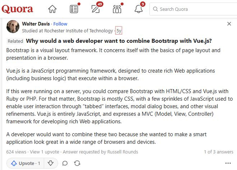
Take a look at what a Quora user said about BootstrapVue.
1.2 Benefits of Using BootstrapVue
The following are the important advantages of using BootstrapVue:
- Enhanced User Experience: BootstrapVue includes a variety of interactive components, such as tooltips, carousels, and modals, that enhance both the visual appeal and functionality of applications.
- Customization Options: BootstrapVue supports easy customization. You can modify component behavior using props, tweak themes, and adjust layouts to create interfaces tailored to specific design and functional requirements with minimal effort.
- Improved Maintainability: As a component-based library, BootstrapVue uses structured Vue components, making code easier to read, maintain, and debug, which ensures long-term maintainability.
- Faster Development: The pre-designed components in BootstrapVue save developers time on UI design and implementation. Its seamless integration with Vue’s reactivity enables quicker app development without sacrificing quality.
- Accessibility Features: BootstrapVue includes built-in accessibility attributes across its components, making applications more inclusive for users with disabilities.
2. Getting Started with BootstrapVue
BootstrapVue lets Vue.js apps use Bootstrap’s responsive grid system and ready-made UI components without depending on jQuery. It integrates Bootstrap’s design with Vue’s reactive structure for efficient, modern web development.
2.1 Prerequisites
- Basic Knowledge of Vue.js: You should understand the fundamentals of Vue, including how components are structured, how directives work, and how data binding connects the UI with your application’s state.
- Node.js and npm/yarn Installed: Ensure Node.js is installed on your system, along with a package manager such as npm or Yarn to handle project dependencies.
- Vue CLI Installed: You’ll need the Vue Command Line Interface installed globally. Install globally using:
npm install -g @vue/cli
2.2 Create a Vue Project
vue create bootstrap-vue-demo cd bootstrap-vue-demo |
Detailed Explanation:
- Vue create bootstrap-vue-demo: This command initializes a new Vue project named bootstrap-vue-demo. You can choose the default setup or specify configuration options according to your project needs.
- cd bootstrap-vue-demo: Changes directory to the project folder you just created, where development will continue.
3. How to Add Bootstrap and BootstrapVue to the Project?
The following are the two ways to proceed with the integration:
3.1 Using npm or yarn Package Managers
We’ll install all the necessary packages mentioned earlier for the project using npm or yarn. To do that, navigate to the project’s root directory and run one of the following commands, depending on your preferred package manager:
npm install bootstrap bootstrap-vue |
Or
yarn add bootstrap bootstrap-vue |
Detailed Explanation:
- This command installs both Bootstrap’s CSS framework and the BootstrapVue library as dependencies in your Vue project.
- Bootstrap provides the core styles, and bootstrap-vue supplies Vue-friendly components that implement Bootstrap’s components.
3.2 Using CDN
This integration method is much easier than the previous approach of using the npm and yarn package managers. For this, open the public/index.html file and add the following links to it:
<!-- In the <head> --> <link type="text/css" rel="stylesheet" href="https://cdn.jsdelivr.net/npm/bootstrap@4.6.2/dist/css/bootstrap.min.css" /> <link type="text/css" rel="stylesheet" href="https://cdn.jsdelivr.net/npm/bootstrap-vue@2.23.1/dist/bootstrap-vue.min.css"/> <!-- Before </body> --> <script src="https://cdn.jsdelivr.net/npm/vue@2.6.14/dist/vue.min.js"></script> <script src="https://cdn.jsdelivr.net/npm/bootstrap-vue@2.23.1/dist/bootstrap-vue.min.js"></script> |
Detailed Explanation:
- This method is ideal for prototypes or quick testing, as it loads Vue and BootstrapVue CSS files directly from CDNs.
- Adding the CSS files within the <head> section ensures that component styles are applied immediately when the page loads.
3.3 Setting up BootstrapVue
Update the main.js file:
import Vue from 'vue'; import App from './App.vue'; import { BootstrapVue, IconsPlugin } from 'bootstrap-vue'; import 'bootstrap/dist/css/bootstrap.css'; import 'bootstrap-vue/dist/bootstrap-vue.css'; Vue.use(BootstrapVue); Vue.use(IconsPlugin); new Vue({ render: h => h(App), }).$mount('#app'); |
Detailed Explanation:
- Start by importing Vue and App to launch your application.
- BootstrapVue and IconsPlugin are imported and registered globally using Vue.use().
- CSS imports ensure that both Bootstrap’s and BootstrapVue’s styles are available.
- Finally, the Vue app is mounted to the DOM element with the ID app.
4. How to Use BootstrapVue Components?
Like Bootstrap’s built-in components, BootstrapVue also provides components specifically for use in Vue.js applications. It even includes components such as b-table, b-sidebar, b-form-tag, etc., that are not available in the core Bootstrap framework.
Let us now understand some of the fundamental BootstrapVue components with their proper implementation:
4.1 Badges
Badges are small, rounded components used to draw attention to specific information, such as notifications, numbers, or labels, and are typically displayed within or alongside larger UI components.
<template> <b-badge variant="primary">New</b-badge> </template> <template> <b-badge variant="info">New</b-badge> </template> <template> <b-badge variant="danger">New</b-badge> </template> <template> <b-badge variant="warning">New</b-badge> </template> <template> <b-badge variant="success">New</b-badge> </template> <template> <b-badge variant="secondary">New</b-badge> </template> |

Detailed Explanation:
- b-badge is used to create a badge element.
- The variant prop lets you choose different color styles, such as primary, success, or danger.
4.2 Building a Bootstrap-Vue Alert Component
The BootstrapVue alert component displays contextual messages with optional dismiss functionality, using Bootstrap’s predefined color variants for emphasis.
<b-button size="sm" @click="toggle"> {{ show ? 'Hide' : 'Show' }} Alert </b-button> <b-alert v-model="show" class="mt-3" dismissible @dismissed="dismissed" > Hello {{ name }}! </b-alert> |

Detailed Explanation:
- b-alert is used for messages such as warnings or confirmations.
- Show ensures the alert is visible.
- Variant controls the color (success = green).
4.3 Scoped Styles
The scoped attribute on the <style> tag is used to apply styles only to a specific component and its children.
<template> <div class="custom-text">Hello with custom style!</div> </template> <style scoped> .custom-text { color: #3498db; font-weight: bold; } </style> |

Detailed Explanation:
- Scoped ensures styles affect only this component and do not leak globally.
- This makes styling more maintainable in large applications.
4.4 Buttons & Icons
Buttons trigger actions in response to various events. You can create different types of buttons with varied styles and functionalities using BootstrapVue’s button component. b-button is the primary component for creating a basic clickable button. The b-icon component lets you include scalable vector icons within a button.
<template> <b-button variant="danger"> <b-icon icon="exclamation-triangle-fill"></b-icon> Delete </b-button> </template> |

Detailed Explanation:
- b-button creates a styled button; variant=”danger” gives it a red theme.
- b-icon renders a Bootstrap icon — here, a warning symbol.
4.5 Navbar Components
Navigation bars play a key role in helping users navigate an application. This component simplifies building flexible, collapsible, and responsive menus.
<template> <b-navbar toggleable="lg" type="dark" variant="dark"> <b-navbar-brand href="#">MyApp</b-navbar-brand> </b-navbar> </template> |

Detailed Explanation:
- b-navbar is a responsive navigation component.
- toggleable=”lg” shows/hides the menu at large screen sizes.
- Variant and type determine the navbar’s background and text colors.
4.6 Listview Component
This component displays a series of items in a vertical list, like an HTML list created using <ul>, <ol>, and <li> tags.
<template> <b-list-group> <b-list-group-item v-for="item in items" :key="item">{{ item }}</b-list-group-item> </b-list-group> </template> <script> export default { data() { return { items: ['Vue', 'Bootstrap', 'JavaScript'] } } } </script> |

Detailed Explanation:
- b-list-group acts as a container for the list.
- v-for dynamically renders each item from the array.
- :key helps Vue track list changes for performance.
4.7 Bootstrap Modals
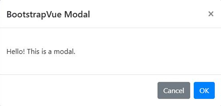
A modal component is a customizable dialog box used to display content, alerts, forms, or confirmations in a pop-up overlay.
<template> <div> <b-button v-b-modal.modal-1>Launch Modal</b-button> <b-modal id="modal-1" title="BootstrapVue Modal"> <p class="my-4">Hello! This is a modal.</p> </b-modal> </div> </template> |

Detailed Explanation:
- v-b-modal.modal-1 is a directive that binds the button to the modal with id=”modal-1″.
- b-modal creates a pop-up dialog. The title prop sets the modal header.
4.8 Datepicker
The datepicker component lets you select dates using an interactive calendar interface within your Vue application.
<template> <b-form-datepicker v-model="date" :date-format="'YYYY-MM-DD'"></b-form-datepicker> </template> <script> export default { data() { return { date: null } } } </script> |
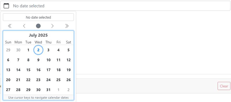
Detailed Explanation:
- b-form-datepicker provides a calendar UI for selecting dates.
- v-model enables two-way binding between the input and your Vue component’s date data.
- :date-format controls how the date is displayed.
4.9 Cards & Media
Cards offer a versatile layout element used to organize and present content clearly. They can include images, text, and interactive elements, making them ideal for showcasing user profiles, products, and other structured information in a clean, orderly format.
<template> <b-card title="Vue Card" img-src="https://via.placeholder.com/600x250" img-alt="Card image" img-top> <p class="card-text">Card content goes here.</p> <b-button variant="primary">Read More</b-button> </b-card> </template> |

Detailed Explanation:
- b-card is a flexible component that can include media, content, and actions.
- img-src and img-top add a header image.
- b-button within the card serves as a call-to-action.
5. Final Thoughts
BootstrapVue bridges the gap between the Bootstrap framework and Vue.js, offering developers a seamless way to build responsive, mobile-first web applications. Its comprehensive library of components, flexibility, and ease of integration make it a solid choice for both beginners and experienced developers. Using BootstrapVue lets you leverage the strengths of both frameworks to build efficient, elegant, and scalable web applications.


Comments
Leave a message...