

Sending alerts or toast notifications is critical for user interaction in React applications. Although a common UI component, toasts provide users with timely updates about their actions or system events without disrupting the experience. To design non-intrusive, customizable toasts, many top React development companies trust React Toastify. It is a React-based library that helps create and customize notifications.
This blog explains the concept of React Toastify, provides an overview of the library and toast notifications, and discusses why you should use them in your React application. More importantly, it gives a step-by-step guide to designing tailored toast notifications.
What is React Toastify?
React Toastify is a library for creating toast notifications and alerts in React apps. Developers use it to display short, relevant messages in response to events. A toast is a small UI box appearing at the bottom of the screen for a limited time to deliver information to users. React Toastify provides ready-made toast components, so you don’t need to build them from scratch; integration into your code is quick and straightforward.
What Are Toast Notifications?
Toast notifications are short, subtle in-app pop-up messages providing feedback to users about their actions or the system’s state. Common in modern apps, they notify users of events such as success, error, or warning without interrupting the workflow.
The user can dismiss a toast manually, but it also disappears after a predetermined time. The nature and purpose of the feedback determine the toast’s placement and styling. Toast notifications are important in React apps as they deliver real-time updates without disrupting the user experience.
Why Use React Toastify?
React Toastify is a popular library with millions of weekly downloads. Below are a few advantages that make it a frequent choice for React developers.
- Easy to Use: Toastify is beginner-friendly. It needs a minimal setup, and its intuitive API enables quick and seamless integration.
- Customizable Design: Toastify allows you to change positions, transitions, and styles to customize the appearance of the project.
- Responsiveness: React Toastify is compatible with different screen sizes and doesn’t require additional code changes to remain responsive.
- Non-Intrusive Notifications: Toast messages appear without interrupting the user’s workflow or the page they are currently viewing.
- Zero Dependencies: Toastify has no external dependencies, making it lightweight and more efficient.
- Feature-Rich: The library offers a wide range of features, including configurable notifications, automatic dismissals, and animations.
Installing and Setting up React-Toastify
When there is a need to use React Toastify, just use one of the following commands to install the library in your React project.
# npm npm install react-toastify # yarn yarn add react-toastify |
After installing the library, import the toast object and ToastContainer component along with a CSS file using the following commands.
import { ToastContainer, toast } from 'react-toastify'; import 'react-toastify/dist/ReactToastify.css'; |
How to Create Toast Notifications?
Generating toast notifications is simple. All you need is a toast function. When creating a toast notification, you can add multiple content types, such as a React component, React element, or a string message, to make the notification richer. A straightforward string toast can notify users quickly and efficiently. Beyond default or generic notifications, this library enables users to create personalized, context-specific toasts.
Basic Example of a Toast Notification
import React from 'react'; import { ToastContainer, toast } from 'react-toastify'; import 'react-toastify/dist/ReactToastify.css'; // Function to show a success toast const notifySuccess = () => { toast.success("Action completed successfully!"); }; // BasicSuccessToast component const BasicSuccessToast= () => { return ( <div style={{ padding: '1rem' }}> <button onClick={notifySuccess}>Show Success Toast</button> {/* Toast container is required to display notifications */} <ToastContainer position="top-right" autoClose={3000} /> </div> ); }; export default BasicSuccessToast; |
React Toastify provides a variety of methods such as toast.success, toast.error, toast.warn, and toast.info. These allow you to create notifications with different styles depending on the message type – success messages in green, errors in red, warnings in yellow, and info in blue.
For more advanced notifications, you can pass a React component to the toast() function. This enables fully customized interfaces with rich content, interactive elements, or buttons. The ToastContainer component is essential to render all toasts, and it comes with configurable options like positioning, auto-close timing, progress bars, and pause-on-hover to enhance user experience.
Customizing Toast Notifications
Toastify is highly customizable, allowing users to change the behavior and appearance of toast notifications to match their app and user requirements. This section describes some methods for customizing toast notifications.
Styling Toast Notifications
React Toastify supports customization of toast notification styling utilizing custom CSS classes or inline styles.
When Using Inline Styles
Inline styles are directly implemented during the development of a toast notification.
import React from 'react'; import { toast, ToastContainer } from 'react-toastify'; import 'react-toastify/dist/ReactToastify.css'; const InlineStyleToast = () => { const notify = () => { toast('This is a customized toast!', { style: { backgroundColor: '#000', // Dark background color: '#fff', // White text fontSize: '16px', // Text size padding: '12px 20px', // Custom padding }, }); }; return ( <div> <button onClick={notify}>Show Custom Toast</button> {/* ToastContainer is required */} <ToastContainer /> </div> ); }; export default InlineStyleToast; |
When using Custom CSS Classes
Custom style classes are defined in the stylesheet, which can later be used in the toast options.
/* styles.css */ .custom-toast { background-color: #333; color: #fff; border-radius: 8px; font-size: 14px; padding: 12px 20px; } Implement the CSS after importing the class. import React from 'react'; import { toast, ToastContainer } from 'react-toastify'; import 'react-toastify/dist/ReactToastify.css'; import './styles.css'; const CustomClassToast= () => { const notify = () => { toast('This is a custom styled toast!', { className: 'custom-toast', }); }; return ( <div> <button onClick={notify}>Show Custom Toast</button> <ToastContainer /> </div> ); }; export default CustomClassToast; |
Customizing Toast Content
Simply passing a React element or component enables you to modify the toast content to match the user context or app requirements
import React from 'react'; import { toast, ToastContainer } from 'react-toastify'; import 'react-toastify/dist/ReactToastify.css'; import './styles.css'; // Optional CSS for custom styling const CustomContentToast = () => { const notify = () => { toast( <div> <strong>Success!</strong> Your operation was successful. </div>, { className: 'custom-toast', // Container styling bodyClassName: 'toast-body', // Body styling progressClassName: 'toast-progress', // Progress bar styling } ); }; return ( <div> <button onClick={notify}>Show Custom Content Toast</button> {/* Required ToastContainer */} <ToastContainer /> </div> ); }; export default CustomContentToast; |
Configuring Toast Options
To control toast behaviour, the library offers several options:
- Position – Set the toast position on the screen:
toast.POSITION.TOP_LEFT, toast.POSITION.BOTTOM_CENTER, etc. - AutoClose – Duration in milliseconds before the toast closes automatically. Set to false to keep it open until manually dismissed.
- HideProgressBar – If true, the progress bar is hidden; otherwise, it is displayed.
- CloseButton – Display or hide the close button.
- Draggable – Allow users to drag the toast to dismiss it.
Example:
import React from 'react'; import { toast, ToastContainer } from 'react-toastify'; import 'react-toastify/dist/ReactToastify.css'; const ConfiguredToast = () => { const notify = () => { // This toast will use the defaults from ToastContainer toast('This toast uses ToastContainer defaults!'); }; return ( <div> <button onClick={notify}>Show Configured Toast</button> {/* ToastContainer with default options */} <ToastContainer position="bottom-center" autoClose={5000} // Default 5 seconds hideProgressBar={true} closeButton={false} draggable={false} pauseOnHover theme="colored" /> </div> ); }; export default ConfiguredToast; |
Custom Toast Transitions
React Toastify supports several transitions for the display and dismissal of the toasts. Utilization of the transition property helps users customize them.
import React from 'react'; import { toast, ToastContainer, Slide } from 'react-toastify'; import 'react-toastify/dist/ReactToastify.css'; const TransitionToast = () => { const notify = () => { // Uses the default transition and options from ToastContainer toast('This toast slides into view smoothly!'); }; return ( <div> <button onClick={notify}>This toast slides into view smoothly</button> {/* ToastContainer with defaults and a custom transition */} <ToastContainer position="top-right" autoClose={3000} // Default 3 seconds hideProgressBar={false} closeOnClick pauseOnHover draggable transition={Slide} // Default slide transition theme="colored" /> </div> ); }; export default TransitionToast; |
Types of Toast Notifications
React Toastify offers 5 types of toast notifications predefined in the library.
- Success Toast: Informs about the successful completion of the action. The notification comes in a green color scheme, displaying a checkmark icon.
- Error Toast: Warns users about failures or errors in the system or action. The notification displays a cross icon with a red color scheme.
- Info Toast: Displays important user information that isn’t specifically negative or positive in a blue color scheme with an information icon.
- Warning Toast: Alerts the users about important messages, possible errors that might cause a problem, or total failure. This toast consists of a warning icon and comes in a yellow or orange color scheme.
- Custom Toast: Provides personalized messages and styling that don’t come in default categories. Custom toasts can be given the icons, content and colors of your choice.
Example: Setting the Toast Notification Position
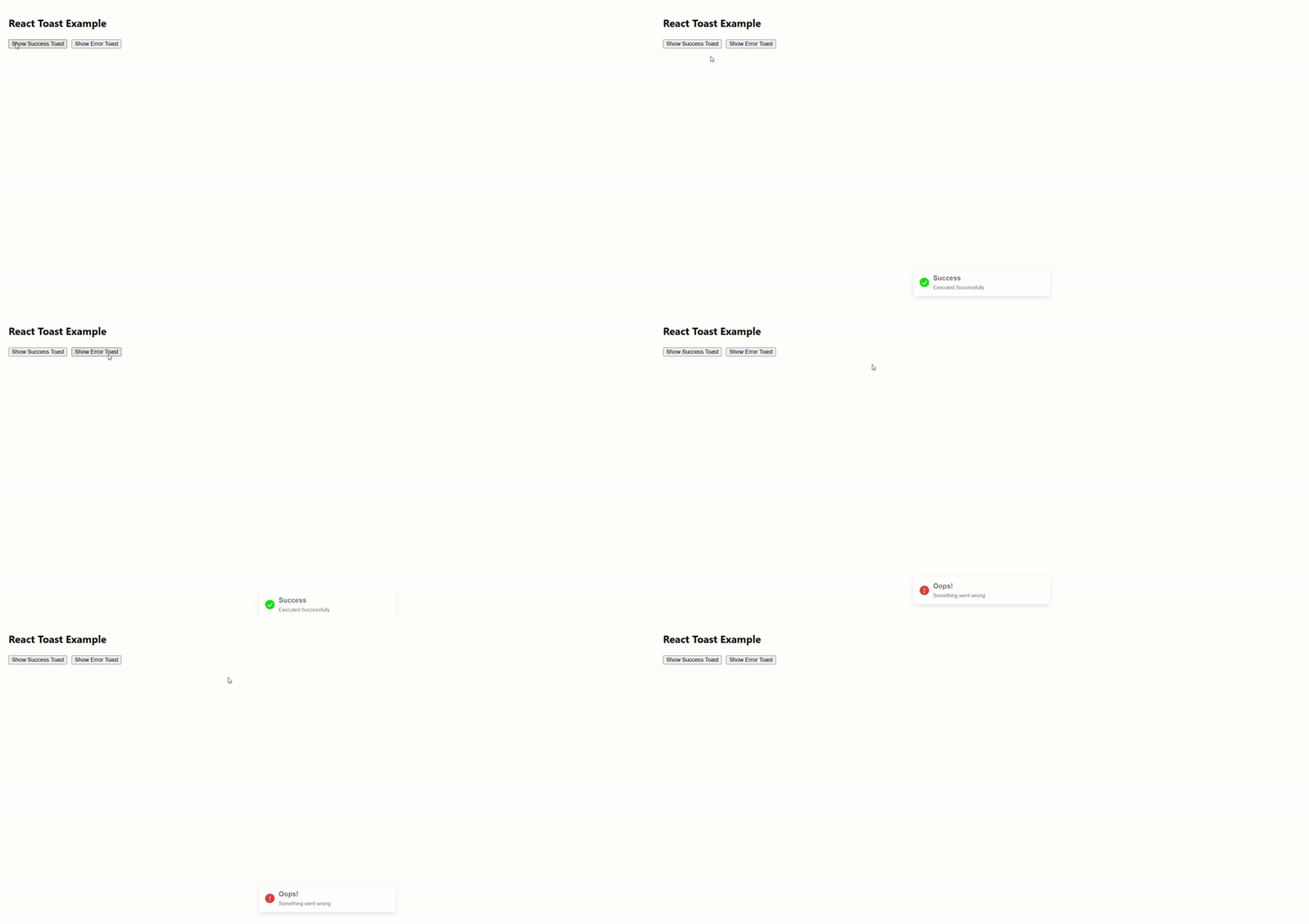
This section walks you through the process of using React Toastify to customize the position of toast notifications on the screen. To initiate the process, we install the package as shown in one of the previous sections and use the ToastContainer to generate a notification and the showToast function to create different toast messages like information, warning, error and success.
Every toast needs a title and description, which are set based on your requirements. The toast.dismiss() function is used to dismiss a toast from the screen. Only one toast will be displayed on the screen at any given time.
Here we consider an example of customizing the toast behavior by setting the position to bottom-center and autoClose to 2000 milliseconds. In short, it is up to you to decide where the notification will appear on the user’s screen and for how long it will stay there.
import React from "react"; import { ToastContainer, toast } from "react-toastify"; import "react-toastify/dist/ReactToastify.css"; const TOAST_SUCCESS = "success"; const TOAST_ERROR = "error"; const TOAST_WARNING = "warning"; const ToastContent = ({ title, description }) => ( <div> <h4 style={{ margin: "0px 0px 5px" }}>{title}</h4> <p style={{ margin: 0, fontSize: "12px" }}>{description}</p> </div> ); const showToast = (title, description, type = "info", options = {}) => { toast.dismiss(); const toastOptions = { className: "custom-toast", ...options, }; const content = <ToastContent title={title} description={description} />; switch (type) { case TOAST_SUCCESS: toast.success(content, toastOptions); break; case TOAST_ERROR: toast.error(content, toastOptions); break; case TOAST_WARNING: toast.warn(content, toastOptions); break; default: toast.info(content, toastOptions); break; } }; const ToastComponent = () => ( <ToastContainer position="bottom-center" closeButton={false} autoClose={2000} hideProgressBar newestOnTop={false} closeOnClick rtl={false} pauseOnFocusLoss draggable pauseOnHover /> ); export default function App() { return ( <div style={{ padding: "20px" }}> <h2>React Toast Example</h2> <button onClick={() =>showToast("Success", "Executed Successfully", TOAST_SUCCESS)}> Show Success Toast </button> <button onClick={() => showToast("Oops!", "Something went wrong", TOAST_ERROR)} style={{ marginLeft: "10px" }} > Show Error Toast </button> <ToastComponent /> </div> ); } |
Conclusion
React Toastify is a flexible, robust library and a go-to option for creating toast-style notifications for React applications. The customizability and rich API offerings of the library give you complete control over the toasts, simplifying the process of designing and positioning the notifications that suit your app requirements. This article covered the practical application of this library, from installation to the customization of various options in toast notifications. If you have any more queries regarding the subject, feel free to contact our React experts.

Parind Shah is responsible for frontend innovations at TatvaSoft. He brings profound domain experience and a strategic mindset to deliver exceptional user experience. He is always looking to gain and expand his skill set.



Comments
Leave a message...