
Have you ever wondered how e-commerce sites vary from traditional online shops when it comes to design? So, how does one go about accomplishing that? And after it’s live, what measures can you along with your eCommerce development company take to ensure it continues to serve your intended audience?
In this article, you’ll learn how to create an ecommerce site keeping the eCommerce user experience in mind that brings in customers and keeps them coming back for more. Look out for some of the best eCommerce UX best practices to follow here!
1. What is eCommerce Site Design?
The term “user experience” (UX) in the area of online stores refers to the process of designing a service around a customer’s needs and requirements at each stage of their life and in return they make a purchase.
The primary aim of e-commerce user experience is to get as many people as possible to make a transaction on your website with as little assistance and as few obstacles as possible.

2. Top eCommerce UX Best Practices for a Successful Site
Following are the top ecommerce UX best practices for a successful site:
2.1 Use Clear and Prominent CTAs
One of the most important factors in the operation of an online shopping store is the use of calls to action, which guide customers through the eCommerce site and draw attention to the goods you want them to buy. On the other hand, not every CTA is the same.

As such, the following are characteristics of an effective CTA:
- Appear engaging and stand out from the page’s design.
- Explain the upcoming steps clearly.
- Use call-to-action buttons (such as “shop now” or “add to cart”) to encourage consumers to make a purchase.
- Calls to action (CTAs) can be effective, but excessive usage can be exhausting.
Simplify and optimize as much as possible; reducing the number of calls to action (CTAs) on every page of the site will help maintain visitors’ attention on the one action you want them to take at that point in their journey with your store.
Want people to buy your latest product line? Just use one enticing call-to-action button to convey this message, and keep the rest of your solicitations for a later time.
2.2 Easy Navigation on Homepage / Landing Page
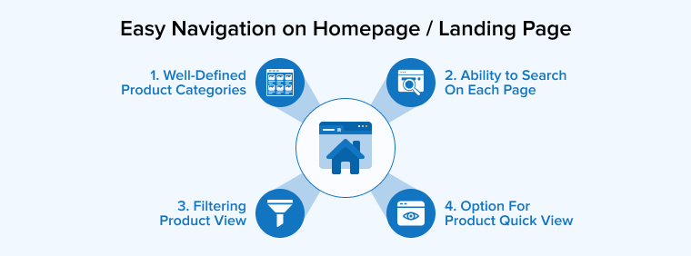
Numerous guidelines and ecommerce trends for creating a positive user experience online have been established as standards. Even while we can’t possibly go deeply into every single one of them, we’ll be sure to highlight the most crucial ones.
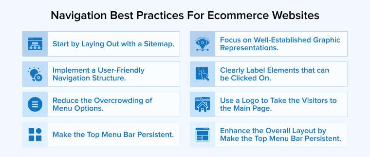
User experience suffers when too much data is shown at once. Although user interface options like pop-ups, forms, and a plethora of links may seem like a good idea at the time, they end up dragging users down in the long run.
2.3 Streamline Your Checkout Process
A cumbersome checkout process is a leading cause of abandoned online transactions so streamlining it is one of the best eCommerce UX best practices. If the procedure takes too long or fails to provide vital information, people are likely to abandon the cart.
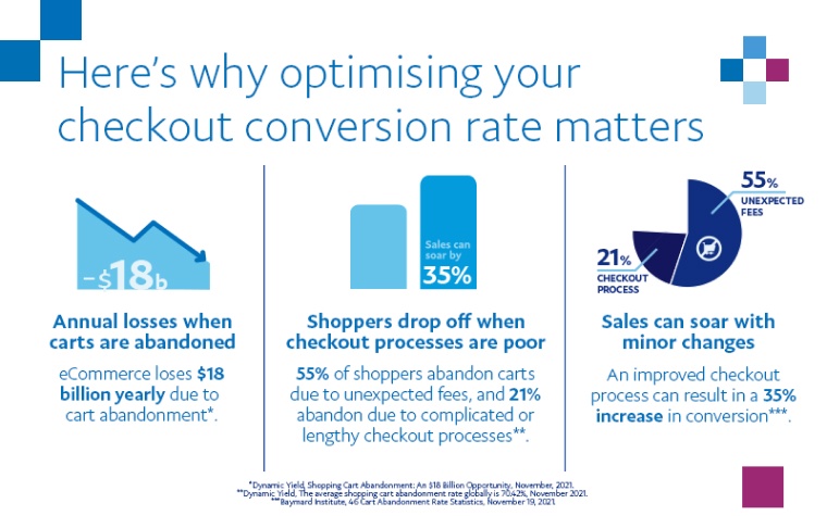
Thankfully, there are several techniques and ecommerce payment gateways to streamline the checkout procedure:
- Utilize visible progress indications (such as numerical steps or stages) in your checkout sequence so that consumers are aware of the duration of the procedure.
- Utilize brief forms that clearly distinguish between essential and optional fields.
- To keep consumers focused on finishing a transaction, enclose the checkout process (and eliminate distractions).
- Over 70% of consumers claimed they leave the checkout procedure when they face additional prices like shipping charges.
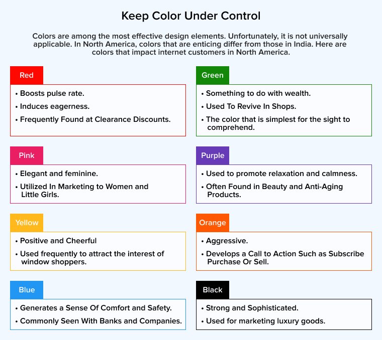
2.4 Keep Color Under Control
Another excellent practice for an online business is to maintain the site’s color scheme. As the site’s shades are effective at adding and eliciting emotions, they must be utilized in moderation. This implies that website and graphic designers must keep the website’s color palette under control and attempt to restrict variances to no more than three.
One of the greatest techniques for creating a consistent website is to employ the company’s brand colors and various tones. Moreover, if designers stick to three basic colors while developing an eCommerce website and match the palette to the goods, it might have a psychological effect on the consumers. For example, blue may be relaxing and reliable. On the contrary, green may be environmentally friendly. In addition, the site must have typefaces and a backdrop with strong contrast, allowing users to see the fonts effectively.
2.5 Optimize Functionality for UX Design
Optimizing the UX design’s usability is another one of the most significant eCommerce UX best practices. Overburdening customers with information is (not so) effective at ensuring they will never return. Another is a page that loads slowly.
According to many analysts, 47% of consumers anticipate an average website to load in less than two seconds.
The tipping point for eCommerce sites is a slow loading speed. If an eCommerce website generates $100,000 per day, experts estimate that a one-second page delay may result in $2.5 million in missed sales annually.
Several factors can slow down your website and landing page, but scripts and graphics are two of the major offenders. Research by Adobe revealed that 39% of users would abandon a website if the photos take too long to load.
The website YOTTAA discovered it was possible to reduce a website’s load time by 33% by consolidating and reducing JavaScripts.
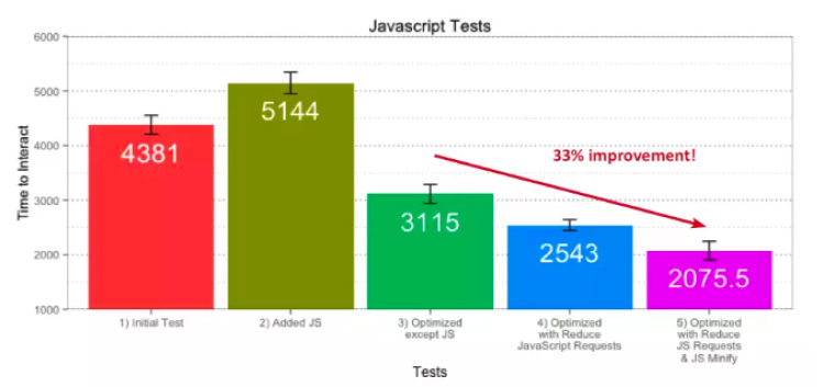
The root of this issue is the presence of third-party JavaScript files, which increase the download speed of your website’s pages. In contrast to posing a security issue, these files can also lead to difficult-to-find website problems.
Chrome’s developer tools include a waterfall visualization tool that may be used to discover which resources are dragging down your website.
2.6 Use Exit-Intent Popups To Offer Deals
You can tell when a user is ready to leave your website by using an exit-intent popup tool like OptinMonster.
Your popup may be an offer to speak with a service representative, a discount incentive, or a call to action to subscribe to your email list in exchange for a freebie.
Actually, most people are fine with pop-ups as long as they’re advertising something they’re interested in. The evidence for this is, how do we recognize?
One of the most important eCommerce UX best practices is to present a compelling offer just when visitors are about to leave your site.
2.7 Make it Mobile-Friendly
When searching on a mobile device, users typically have a clear goal in mind and limited time to locate it.
The mobile user journey should be shortened and simplified as much as feasible. Incorporating measures such as:
- Easily-adhered menu bar, parent category pages and sub categories.
- A mobile-friendly version of the traditional pop-up.
- Call-Button Interfaces.
- Scroll bars with a clickable interface.
- Controls that allow the user to zoom in and out with a pinch.
2.8 Use Informative & High-Quality Images
According to Studio Digita’s CEO Travis Bennett, “include high-quality product photographs that display a variety of angles and offer a potential buyer an understanding of what it is that they are truly buying.” Customers are more likely to answer “yes, I want this” when presented with a wealth of information, such as in the form of photographs and videos.
The only reason is most people buy what and how they see because a visual representation plays a big role for any eCommerce site to communicate with the visitors in their trust.
2.9 Add Proper Site Search
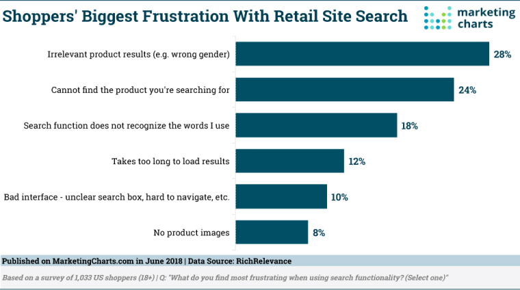
When it comes to e-commerce, and providing a positive user experience (UX), nothing is more important than a site search function that really works. People that use the search box have higher conversion optimization rates because their objective is more obvious.
If visitors can’t discover the search bar or it doesn’t work, they won’t be able to find the solutions they need, and they won’t have a good impression of your business.
2.10 Use Geo-Location Targeting
Geo-targeting is a tool used by forward-thinking eCommerce store owners to present deals relevant to a certain geographic area.
To reach clients in a different language, this tactic might be useful. If a user comes to your site from France, for instance, they’ll see the ad in their native language.
Swapping out graphics and ads is another geo-location targeting perk that helps you target the appropriate customers with the right deals at the right time.
2.11 Highlight Your Site’s Security
Users’ heightened awareness of their own online susceptibility may be traced back to a small number of high-profile security incidents at major online retailers. One of the most crucial eCommerce UX best practices for sites is, therefore, to increase trust and reliability.
Fortunately, this is not too difficult to implement. You can quickly and easily show clients that the safety of their personal information is a top priority by displaying security badges in a conspicuous location on your site. A well-written, easily accessible security policy is also recommended.
2.12 Allow List Creation
Some of the most successful e-commerce sites have grown popular because they facilitate client list-making. Since not everyone will be completely sure of their choices immediately, it’s important to give customers time to think it through. Customers are more likely to buy from an online store if you provide them the option to add items to a wish list and with return and exchange options.
Some of the most popular shopping websites, like Amazon, Kohl’s and Macy’s employ this strategy to provide their customers with a more satisfying shopping experience. Customers may make their own labels to categorize things anyway they choose, including by their own interests and by most-wanted items.
When online shoppers are prepared to make a final transaction, they may use these lists to narrow down the options. However, contacting a private firm that provides UX design services is a good choice if you don’t want to mess with your UX design.
2.13 Include Reviews on Product Pages
Adding customer ratings or feedback on product details can be a highly effective way to convert site visitors into purchases.
In addition to product ratings, users are interested in learning about the quality of customer care they had while buying things.
By presenting customer ratings on the product page, you demonstrate to new guests that you are a reputable vendor.
And since 88% of people buy from eCommerce sites with predominantly positive reviews, you cannot afford to exclude them from your product pages.
- Note the contrast between “mainly” favorable reviews and “positive” reviews.
- Don’t fret if you have a few unfavorable reviews. These can help your website and items appear more genuine. After all, it’s impossible to satisfy everyone!
- You just need to understand how to respond to unfavorable comments in a manner that enhances your reputation.
- The comment parts on Amazon are the ideal example. They have rankings and display comments by feature, and nearly every product has more than fifty reviews.
- You may even show comments and feedback directly on the checkout page to bolster customers’ confidence in their purchase decision.
2.14 Provide Multiple Ways to Get in Touch
Users are more likely to press the “Buy” button if they are confident in their ability to reach you in the event of a problem.
- Include a page for inquiries that lists your email, phone number, and store address.
- Add social proof via place connections to social media accounts.
- Make sure to include a frequently asked questions section.
Real-time chatting – Consumers do not always purchase what they seek. Typically, they depart with what they were sold. This cardinal rule is as ancient as the universe, yet it works exceptionally well in the realm of e-commerce. It is also essential for prospective purchasers to realize that there is a person on the website. The simplest way to do this is by enabling a live chat to assist clients in finding and selecting the proper items and by offering additional services and products to boost the average check.
3. Conclusion
Online and mobile shopping has become an integral part of our daily life. This approach has made e-commerce a feasible method for performing global and local business transactions.
There is a market potential for fresh startup companies, but you will be fighting against well-established competition. People are willing to quit a website at the first sign of a slow-loading image or a broken link.
The fundamentals are no longer sufficient; you must adopt eCommerce UX best practices. You must go above and beyond simple functionality and provide something distinctive to make your consumers feel special.
One approach to guarantee you have a fair shot is by developing a solid User Experience.




Comments
Leave a message...