
Data is boring. It doesn’t even look good unless you present it in systematically organized charts and graphs. They help make your data engaging and aesthetically pleasing. Charts help understand necessary information as well as extract valuable insights.
However, creating data visualizations and charts is a time-consuming task. Therefore, experts from React development companies leverage charting libraries that allow the applications to retrieve the data from the database and display it in the myriad ways possible.
You can also use multiple chart types from popular React chart libraries to create impressive data visualizations and help users gain relevant insights. This article provides you with a list of top React data visualization libraries to help you find a suitable option for your upcoming project.
1. What is a React Chart Library?
A React Chart library is a collection of pre-built components and functionalities that help developers create various types of charts and graphs for their React applications. In addition to various components, these chart libraries also provide interactivity features and customization options.
Web developers do not have to worry about designing and presenting actual data as these charting libraries take care of all that and allow you to focus on producing real data. You can access different types of data using different charts in both mobile and web apps. They enable you to represent complex data in a visually appealing and meaningful manner.
They offer various types of charts including bubble charts, pie charts, line charts, bar charts, radar charts, heatmaps, contour plots, and more. It is easy to work with charts in React, thanks to React chart libraries.
2. Why Use React Chart Libraries?
In web development, React chart libraries can help you create engaging data visualization. With React chart libraries, there is no need to write the code from scratch. It offers pre-built components and APIs that allow you to build complex graphs and charts easily.
React offers a large range of chart libraries that can help you create interactive and animated charts. Developers can pick a suitable type of chart from a variety of options to represent their data efficiently. Moreover, these charts are easy to customize. You can modify or extend the chart behavior to fulfill specific requirements using hooks and APIs from the chart library.
The charts created using these libraries are easy to read and use across various devices and screen resolutions. React chart libraries are optimized for performance. So, they can handle large sets of data efficiently. They also offer seamless integration with almost every tool and library in the React ecosystem.
Now that you have come to understand the importance of using React chart libraries, it’s about time we get into the details of the most popular options available in the market.
3. 10 Best React Chart Libraries For Your Project
Developers nowadays have loads of work. They can ease off some of that burden by using various tools and libraries. Here is a list of the most popular React chart libraries.
3.1 D3.js
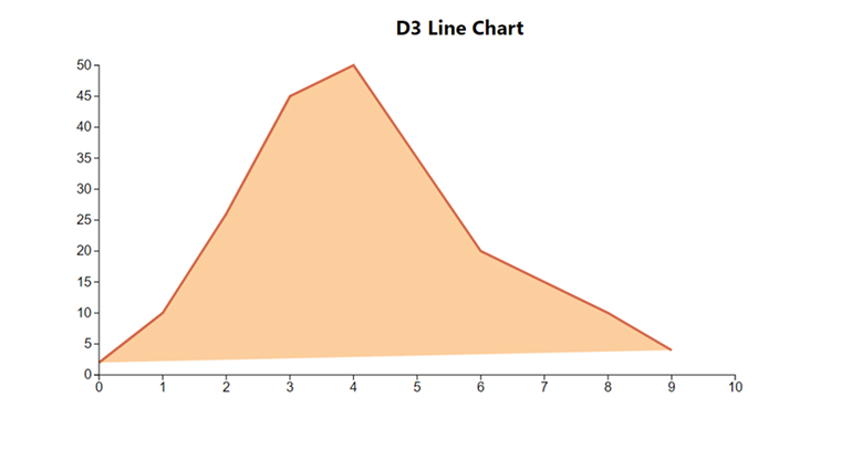
Imagine any kind of visualization and you can create it using the tools provided by D3.js, a low-level library. That is why D3.js is considered a data visualization behemoth. It offers exceptional flexibility for creating any kind of chart.
D3.js is also good at managing large datasets. Its robustness and flexibility are the reason why developers opt for this library. However, you need some time to learn and master the library. It has more than 108k GitHub stars.
Features:
- Optimized performance.
- Strong community support.
- Unparalleled flexibility.
Usages:
- Bar chart
- Pie chart
- Line chart
- Circle chart
- Donut chart
- Bubble chart
Demo
import { useEffect, useRef } from "react"; import * as d3 from "d3"; const D3 = () => { const d3Data = [2, 10, 26, 45, 50, 35, 20, 15, 10, 4]; const svgRef: any = useRef(); useEffect(() => { if (!d3Data) return; const svg = d3.select(svgRef.current); svg.selectAll("*").remove(); const width = 800; const height = 400; const margin = { top: 10, right: 10, bottom: 20, left: 30 }; const innerWidth = width - 40; const innerHeight = height - 30; const xScale = d3 .scaleLinear() .domain([0, d3Data.length]) .range([0, innerWidth]); const yScale = d3 .scaleLinear() .domain([0, 50]) .nice() .range([innerHeight, 0]); const d3Line: any = d3 .line() .x((d, i) => xScale(i)) .y((d: any) => yScale(d)); svg .append("g") .attr("transform", `translate(${margin.left},${margin.top})`) .append("path") .datum(d3Data) .attr("fill", "#fcce9e") .attr("stroke", "#d46b4c") .attr("stroke-width", 3) .attr("d", d3Line); svg .append("g") .attr( "transform", `translate(${margin.left},${innerHeight + margin.top})` ) .call(d3.axisBottom(xScale)); svg .append("g") .attr("transform", `translate(${margin.left},${margin.top})`) .call(d3.axisLeft(yScale)); }, [d3Data]); return ( <div className="container"> <div className="content"> <div className="d3charts"> <h2 className="chart-header">D3 Line Chart</h2> <svg ref={svgRef} width={800} height={400}></svg> </div> </div> </div> ); }; export default D3; |
3.2 react-chartjs-2
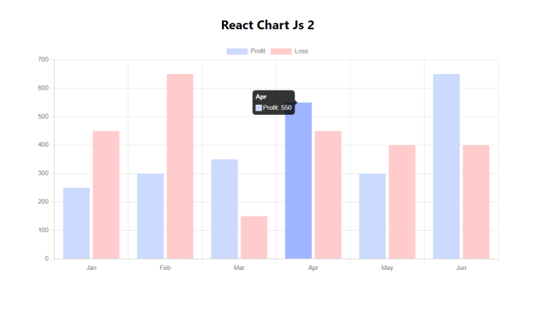
React-chartjs-2 is a React wrapper for the Chartjs library. With over 6.4k GitHub stars and 770k npm downloads, React Chartjs 2 provides client-side rendering and is drawing support only for Canvas. All the charts in this React chart library are responsive by default. It offers various unique chart styles and allows easy customization.
React Chartjs 2 has garnered support from a large community and can function perfectly on every single modern browser. You can use yarn or npm to install this React chart library.
Features:
- React component syntax.
- Charts are responsive by default.
- Allows easy customization.
- Canvas support/No SVG support.
- Open Source.
- Supports animation.
Usage:
- Bar charts
- Area charts
- Line charts
- Pie charts
- Radar charts
- Bubble charts
- Gradient charts
- Scatter charts
Demo
import { Bar } from "react-chartjs-2"; import { Chart as ChartJS, CategoryScale, LinearScale, BarElement, Title, Tooltip, Legend, } from "chart.js"; ChartJS.register( CategoryScale, LinearScale, BarElement, Title, Tooltip, Legend ); export const chartJSOptions = { responsive: true, plugins: { legend: { position: "top" as const, }, }, }; const labels = ["Jan", "Feb", "Mar", "Apr", "May", "Jun"]; export const reactChartData = { labels, datasets: [ { label: "Profit", data: [250, 300, 350, 550, 300, 650], backgroundColor: "#ccd9ff", }, { label: "Loss", data: [450, 650, 150, 450, 400, 400], backgroundColor: "#ffcccc", }, ], }; const ReactChartJs2 = () => { return ( <div className="container"> <div className="content"> <div className="react-chart-js-2"> <h2 className="chart-header">React Chart Js 2</h2> <Bar data={reactChartData} options={chartJSOptions} /> </div> </div> </div> ); }; export default ReactChartJs2; |
3.3 Recharts
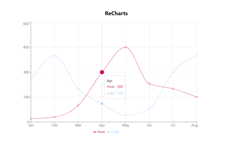
Blending the elegance of React with D3’s power, Recharts is a great option for building stylish and responsive charts with an intuitive API. React’s simplicity and D3’s extensive capabilities create a perfect synergy.
The charting library provides customization features and is still more user-friendly than D3. Recharts has more than 22.3k GitHub stars.
Features:
- Lightweight components.
- Native SVG support.
- Simple customization.
- Seamless integration.
Usage:
- Line charts
- Bar charts
- Pie charts
Demo
import { LineChart, Line, XAxis, YAxis, CartesianGrid, Tooltip, Legend, } from "recharts"; const rechartData = [ { Name: "Jan", Cold: 250, Heat: 20, Amt: 30 }, { Name: "Feb", Cold: 400, Heat: 30, Amt: 40 }, { Name: "Mar", Cold: 200, Heat: 100, Amt: 80 }, { Name: "Apr", Cold: 110, Heat: 300, Amt: 160 }, { Name: "May", Cold: 40, Heat: 450, Amt: 200 }, { Name: "Jun", Cold: 80, Heat: 230, Amt: 210 }, { Name: "Jul", Cold: 300, Heat: 200, Amt: 250 }, { Name: "Aug", Cold: 400, Heat: 150, Amt: 300 }, ]; const Recharts = () => { return ( <div className="container"> <div className="content"> <div className="recharts"> <h2 className="chart-header">ReCharts</h2> <LineChart width={800} height={500} data={rechartData}> <CartesianGrid strokeDasharray="3 3" /> <XAxis dataKey="Name" /> <YAxis /> <Tooltip /> <Legend /> <Line type="monotone" dataKey="Heat" stroke="#cc0066" activeDot={{ r: 10 }} /> <Line type="monotone" dataKey="Cold" stroke="#99ccff" activeDot={{ r: 6 }} /> </LineChart> </div> </div> </div> ); }; export default Recharts; |
3.4 BizCharts
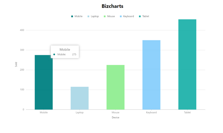
The tech giant Alibaba offers charting services for G2 and React-based business apps. It introduced BizCharts as a template library which is very versatile and impressive. BizCharts is popular for providing the most extensive chart collection.
Developers can use this as a comprehensive base for data visualization and designing. BizCharts is very popular, especially in Asia, and has a total of 20452 npm downloads in a week. On GitHub, BizCharts has 6.1k stars.
Features:
- Provides a large array of charts.
- Easy customization.
Usage:
- Line charts
- Bar charts
- Pie charts
Demo
import { Chart, Geom, Axis, Tooltip, Legend } from "bizcharts"; const bizChartData = [ { Device: "Mobile", Sold: 275 }, { Device: "Laptop", Sold: 115 }, { Device: "Mouse", Sold: 225 }, { Device: "Keyboard", Sold: 350 }, { Device: "Tablet", Sold: 455 }, ]; const Bizcharts = () => { return ( <div className="container"> <div className="content"> <div className="bizchart"> <h2 className="chart-header">Bizcharts</h2> <Chart width={900} height={500} data={bizChartData} forceFit> <Axis name="Device" title /> <Axis name="Sold" title /> <Legend position="top" textStyle={{ fontSize: 18 }} /> <Tooltip /> <Geom type="interval" label={"test"} position="Device*Sold" color={[ "Device", ["#008080", "#ADD8E6", "#90EE90", "#87CEFA", "#20B2AA"], ]} /> </Chart> </div> </div> </div> ); }; export default Bizcharts; |
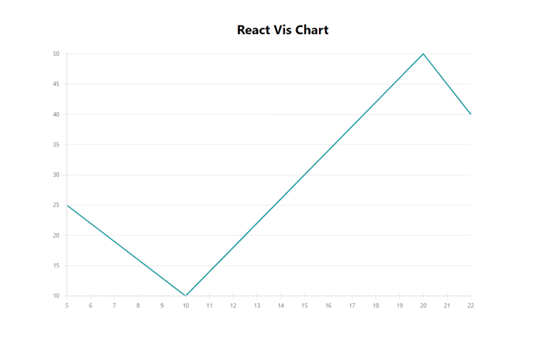
3.5 React Vis
Uber supports one of the most beginner-friendly chart libraries, React Vis. This library is just a collection of React components that enables you to render common data visualization charts. React Vis allows you to visualize your data in line, bar, pie, and area charts, scatter plots, heatmaps, and more. It has 8.7k stars on GitHub and around 88,898 weekly npm downloads.
Features:
- Ease of use.
- Beginner-friendly charting solutions.
- Seamless integrations.
- Flexibility.
Usages:
- Line charts
- Bar charts
- Pie charts
- Area charts
- Scatterplots
- Heatmaps
- Contour plots
- Hexagon charts
Demo
import { XYPlot, XAxis, YAxis, HorizontalGridLines, LineSeries, } from "react-vis"; const visData = [ { x: 5, y: 25 }, { x: 10, y: 10 }, { x: 15, y: 30 }, { x: 20, y: 50 }, { x: 22, y: 40 }, ]; const Reactvis = () => { return ( <div className="container"> <div className="content"> <div className="react-vis"> <h2 className="chart-header">React Vis Chart</h2> <XYPlot width={800} height={500}> <HorizontalGridLines /> <LineSeries data={visData} /> <XAxis /> <YAxis /> </XYPlot> </div> </div> </div> ); }; export default Reactvis; |
3.6 Echarts
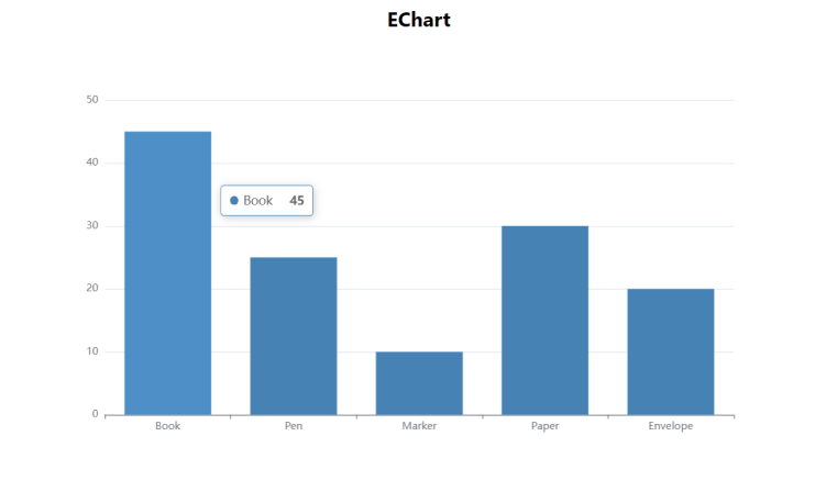
If you are looking for a versatile and robust data visualization solution then Apache Echarts is the right pick for you. Multiple chart types and various customization options are available in this open-source library. Creating interactive and visually appealing charts becomes easy for developers using Echarts. More importantly, it has over 58.8 k stars on GitHub.
Features:
- Provides multiple chart types.
- Responsive design.
- Extensive customization options.
Usage:
- Line charts
- Bar charts
- Pie charts
- Polar charts
- Heatmaps
- Scatter plots
- Treemaps
- Funnel charts
- Box plots
- Gauge charts
Demo
import ReactECharts from "echarts-for-react"; const eChartOptions = { tooltip: {}, xAxis: { data: ["Book", "Pen", "Marker", "Paper", "Envelope"], }, yAxis: {}, series: [ { type: "bar", data: [45, 25, 10, 30, 20], itemStyle: { color: "#4682B4", }, }, ], }; const Echarts = () => { return ( <div className="container"> <div className="content"> <div className="echarts"> <h2 className="chart-header">EChart</h2> <ReactECharts option={eChartOptions} style={{ height: "500px", width: "100%" }} /> </div> </div> </div> ); }; export default Echarts; |
3.7 Ant Design Charts
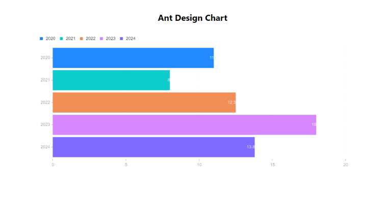
Ant Design Charts is the right React chart library for developers who want to create informative and interactive data visualizations. It puts a great emphasis on offering a seamless user experience as it is a user-focused React charting library. Ant design charts have over 1.8k stars on GitHub.
Features:
- Responsive design.
- A comprehensive suite of React components for data visualization.
- Comes with a variety of chart types.
- Provides high-quality charts by default.
- Allows customization.
Usage:
- Waterfall charts
- Line charts
- Pie charts
- Gauge charts
- Area charts
- Funnel charts
- Scatter charts
- Bar charts
- Radar charts
Demo
import { Bar } from "@ant-design/charts"; const AntDesignCharts = () => { const antDesignChartData = [ { year: "2020", value: 11 }, { year: "2021", value: 8 }, { year: "2022", value: 12.5 }, { year: "2023", value: 18 }, { year: "2024", value: 13.8 }, ]; const config = { data: antDesignChartData, xField: "year", yField: "value", height: 400, colorField: "year", label: { style: { fill: "#FFFFFF", opacity: 1, }, }, }; return ( <div className="container"> <div className="content"> <div className="ant-design-charts"> <h2 className="chart-header">Ant Design Chart</h2> <Bar {...config} /> </div> </div> </div> ); }; export default AntDesignCharts; |
3.8 Nivo
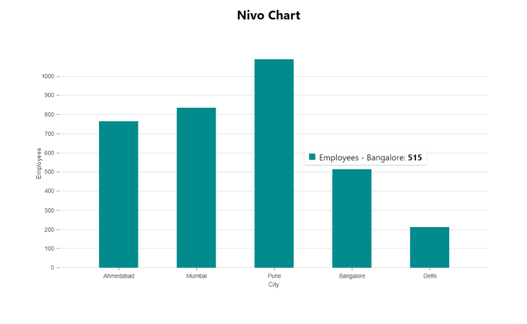
When it comes to data visualization using JavaScript, D3.js is considered one of the most powerful libraries and Nivo is built on top of D3.
Being one of the most popular React chart libraries, Nivo is supported by an active community. So, it is well-maintained as contributors resolve many issues every month. This open-source React chart library has gained many supporters through its Open Collective page. Nivo has over 12.6k GitHub stars and has 1.4M downloads per month.
Features:
- Provides various customization options.
- Comes with Detailed Documentation.
- Theming.
- Patterns & Gradients.
- Offers Interactive Components Playground.
- Server Side Rendering and HTTP API.
Usage:
- Bar
- Bump
- Calendar
- Chord
- GeoMap
- Line
- Network
- Pie
- RadialBar
- ScatterPlot
- Sunburst, and more
Demo
import { ResponsiveBar } from "@nivo/bar"; const nivoData = [ { City: "Ahmedabad", Employees: 765 }, { City: "Mumbai", Employees: 836 }, { City: "Pune", Employees: 1089 }, { City: "Bangalore", Employees: 515 }, { City: "Delhi", Employees: 213 }, ]; const Nivo = () => { return ( <div className="container"> <div className="content"> <div className="nivo"> <h2 className="chart-header">Nivo Chart</h2> <div style={{ width: "100%", height: "500px" }}> <ResponsiveBar data={nivoData} keys={["Employees"]} indexBy="City" margin={{ top: 50, right: 40, bottom: 50, left: 60 }} padding={0.5} valueScale={{ type: "linear" }} colors="#008B8B" animate={true} enableLabel={false} axisTop={null} axisRight={null} axisLeft={{ tickSize: 5, tickPadding: 5, tickRotation: 0, legend: "Employees", legendPosition: "middle", legendOffset: -40, }} axisBottom={{ tickSize: 5, tickPadding: 5, tickRotation: 0, legend: "City", legendPosition: "middle", legendOffset: 32, }} /> </div> </div> </div> </div> ); }; export default Nivo; |
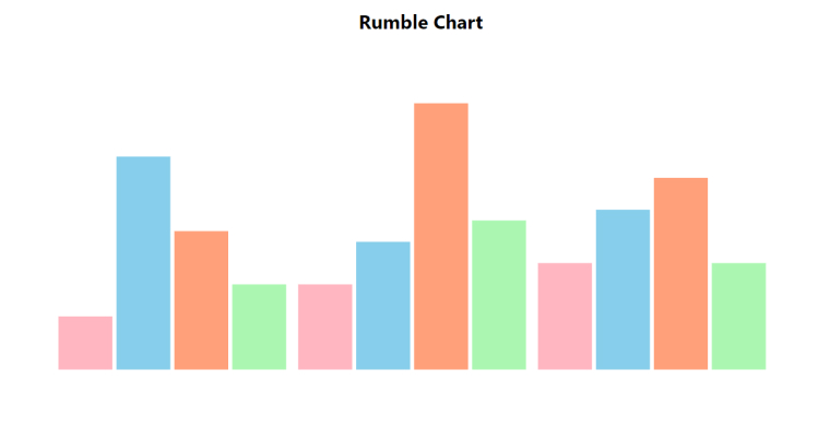
3.9 Rumble Charts
A collection of React chart components that enables you to create composable and flexible charts is none other than Rumble charts. You can add it to your React app using a package manager. Using this library saves a lot of time on coding as it offers boilerplate code. Sadly, Rumble charts have only 346 stars on GitHub.
Features:
- Optimized for different screen sizes.
- Offers customizable components.
- Composable.
- Provides a variety of components.
Usage:
- Line charts
- Bar charts
- Pie charts
- Cloud charts
- Area charts
- Scatter plots
Demo
import { Chart, Bars } from "rumble-charts"; const rumbleChartSeries = [ { data: [5, 8, 10], }, { data: [20, 12, 15], }, { data: [13, 25, 18], }, { data: [8, 14, 10], }, ]; const RumbleCharts = () => { return ( <div className="container"> <div className="content"> <div className="rumble-chart"> <h2 className="chart-header">Rumble Chart</h2> <Chart width={900} height={400} series={rumbleChartSeries} minY={0} maxY={30} > <Bars innerPadding={5} groupPadding={10} colors={["#FFB6C1", "#87CEEB", "#FFA07A", "#ABF7B1"]} /> </Chart> </div> </div> </div> ); }; export default RumbleCharts; |
3.10 Visx
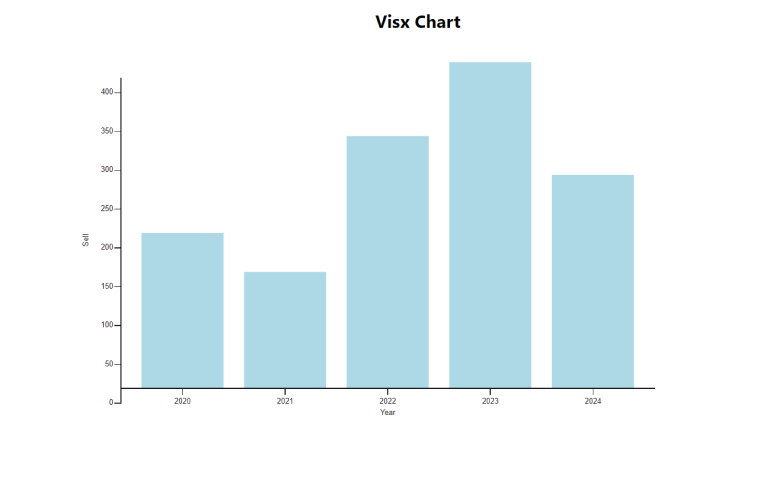
Airbnb developed a react chart library called Visx which gained immediate success and has more than 18.7k GitHub stars. The greatest benefit of using Visx as the active repository is that it offers the combined benefits of both D3.js and React DOM.
However, it might pique your interest to know that the developers of Visx claim that it isn’t a React chart library. Rather they see it as a low-level, and reusable graphical component.
Feature:
- Easy to use.
- Reusable chart components.
- D3 helps with the calculations.
- Low-level graphical components.
- Modular design.
- Highly flexible and customizable.
Usage:
- Line charts
- bar charts
Demo
import { scaleLinear, scaleBand } from "@visx/scale"; import { AxisLeft, AxisBottom } from "@visx/axis"; import { Bar } from "@visx/shape"; const Visx = () => { const visxData = [ { year: "2020", sell: 200 }, { year: "2021", sell: 150 }, { year: "2022", sell: 325 }, { year: "2023", sell: 420 }, { year: "2024", sell: 275 }, ]; const width = 800; const height = 500; const margin = { top: 20, right: 20, bottom: 40, left: 60 }; const xScale = scaleBand({ domain: visxData.map((d) => d.year), range: [margin.left, width - margin.right], padding: 0.2, }); const yScale = scaleLinear({ domain: [0, Math.max(...visxData.map((d) => d.sell))], range: [height - margin.bottom, margin.top], }); return ( <div className="container"> <div className="content"> <div className="visx"> <h2 className="chart-header">Visx Chart</h2> <svg width={width} height={height}> {visxData.map((d, i) => ( <Bar key={i} x={xScale(d.year)} y={yScale(d.sell)} width={xScale.bandwidth()} height={height - margin.bottom - yScale(d.sell)} fill="#ADD8E6" /> ))} <AxisLeft scale={yScale} top={margin.top} left={margin.left} label={"Sell"} stroke={"#1b1a1e"} /> <AxisBottom scale={xScale} top={height - margin.bottom} label={"Year"} stroke={"#1b1a1e"} /> </svg> </div> </div> </div> ); }; export default Visx; |
4. Choosing The Right React Chart Library For Your Project – A Short Guide
It isn’t about the features of the React chart libraries. It’s about your requirements. The first thing you need to do is check out what types of charts you need to use, what kind of data you have to visualize, and what level of interactivity is expected. Gaining clarity on such requirements would help narrow down your options.
Now, we discuss certain instances where your requirements determine which library you should use in your next project.
4.1 Consistency
Using the popular React charting library from the same ecosystem is important if design systems are critical for your React project. It helps you give a consistent look and feel to your app across all platforms. Ant design charts or MUI charts are very helpful in similar instances.
4.2 Compatibility
You might be using some other libraries and technologies for software development. Sometimes you have to integrate them with the charting libraries to fulfill your requirements. So, the React chart library which has great compatibility and offers seamless integration with various libraries, frameworks, and other platforms, is the right choice for you.
First, you have to consider the browser compatibility for a chart library. Some customers prefer to use specific browsers. So know what browsers your app needs to work with. Then ensure that the library you are selecting supports data visualization across all the browsers you want to run your app on.
Similarly, you have to consider the library’s compatibility with various devices you want to launch your app on.
4.3 Customizability
Certain projects can work with the charts provided by the react libraries. But some need highly customized designs. The ability to modify the design of the default graphs including their colors, grid lines, and more is called customizability. Libraries with such capabilities are useful in large React projects.
4.4 Input Data Format
Another essential aspect you need to check is the input data format. One would like to use a library that supports multiple data types but JSON is sort of an industry standard. However, it depends on your project requirements or preferences.
4.5 The Learning Curve
Never ignore the learning curve. The easier a library is to learn, the quicker you can start your project. Apart from that, also consider how supportive and active the community library is. Those two things can help reduce your development time. Even in the cases where you have to deal with complex APIs.
5. Conclusion
Tons of good React chart libraries are available in the market. It is not possible to include them all in a single article. Therefore, we picked some of the most trusted and preferred libraries of the React community.
A chart library is designed to help developers achieve specific goals. Therefore, it is necessary to analyze their functions and features against your project requirements.
Some React chart libraries are better at customization, some are good at integration, some libraries are suited for small projects whereas others are the right fit for large projects. So, you have to identify your project requirements and determine which library offers features and functions that can fulfill them.
If you are venturing into data visualizations with React then it is recommended that you first understand the requirements of your audience, the type of visualization you need, and most importantly, the nature of your data.
FAQs
Do React chart libraries support real-time data updates?
Many top react chart libraries support real-time data updates. This allows you to implement animations and transitions seamlessly. React provides various techniques for real-time updates. To ensure optimal real-time data rendering, you have to handle the state of your React application efficiently.
Which is the most used react chart library?
The most used react chart library is Recharts, followed by react-chartjs-2, nivo, and Visx. These popular libraries are largely used for curating charts and graphs in React web apps.
What Charts are used in React?
In React, you can use a wide range of charts like line charts, pie charts, bar charts, area charts, radar charts, bubble charts, scatter charts, and more.





Comments
Leave a message...